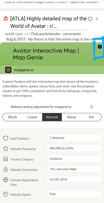
The Close Button for the website details (the small X in the top right corner of the UI Element which allows for changing the priority of a search domain) is quite small and hard to tap on mobile devices.
The clickable are should be increased to the minimum suggested size of 44x44px (https://www.w3.org/WAI/WCAG22/quickref/?versions=2.1#target-size-enhanced)
This could be done without increasing or changing the icon itself, it would be enough to just increase the clickable area.
The user would always use the feature (or the improvement) by having an decreased chance of missing the close Button.
