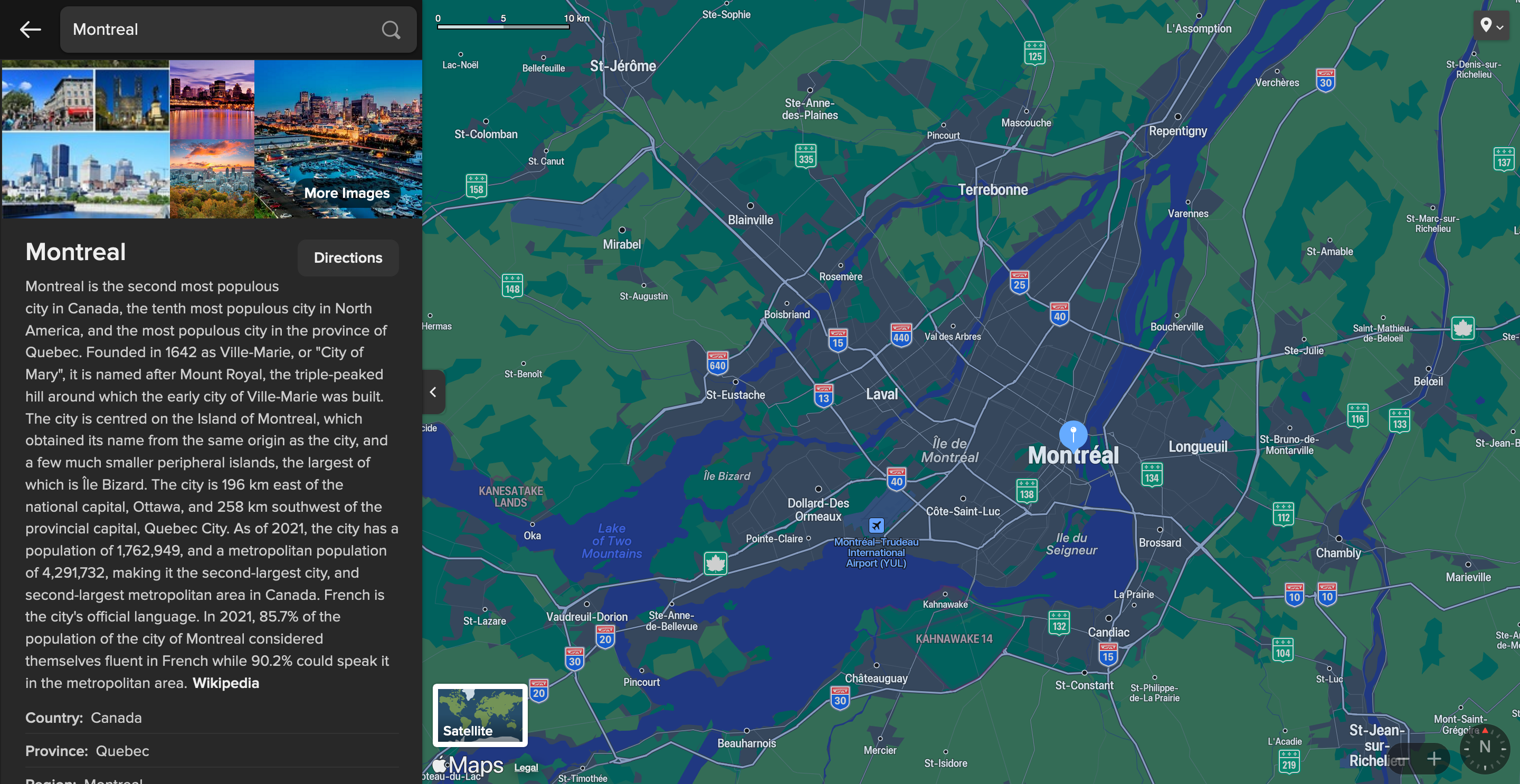
It would be fantastic if Kagi Search could introduce a dark mode option for the map tiles and user interface elements, similar to the dark mode available in Apple Maps. When I'm using Kagi Search with dark mode enabled for the overall interface, the current light-colored map tiles and elements feel inconsistent and out of place. Having a dark map would create a more cohesive and visually pleasing experience that better fits the dark theme.
There are several benefits to offering a dark mode option for maps:
- Reduced eye strain: Dark mode can be easier on the eyes, especially in low-light environments or at night. It reduces the contrast between the screen and the surroundings, making it more comfortable to view the map for extended periods.
- Battery savings: On devices with OLED screens, dark mode can potentially conserve battery life. By displaying more black pixels, the device consumes less power compared to a predominantly white screen. While the energy savings may be modest, it can still make a difference for users who heavily rely on maps throughout the day.
- Enhanced visual design: A well-designed dark mode map can enhance the overall visual appeal of the app. The darker tones can make certain map features, labels, and points of interest stand out more prominently. It creates a sleek and modern look that complements the dark theme of the Kagi Search interface.
- Improved readability in certain conditions: In some situations, such as navigating at night or in dimly lit environments, a dark mode map can improve readability. The reduced glare and higher contrast between the map elements and the dark background make it easier to discern important information at a glance.
Implementing a dark mode option for Kagi Search Maps would greatly enhance the user experience and provide a more seamless integration with the overall dark theme. It would demonstrate Kagi's commitment to offering a customizable and visually pleasing search experience tailored to users' preferences.
Thank you for considering this feature request. I believe many users would appreciate the addition of a dark mode option for maps in Kagi Search.
Provide a similar color scheme as Apple Maps Dark or Google Maps Dark on mobile.
Below is an example from Apple Maps, via DuckDuckGo:
