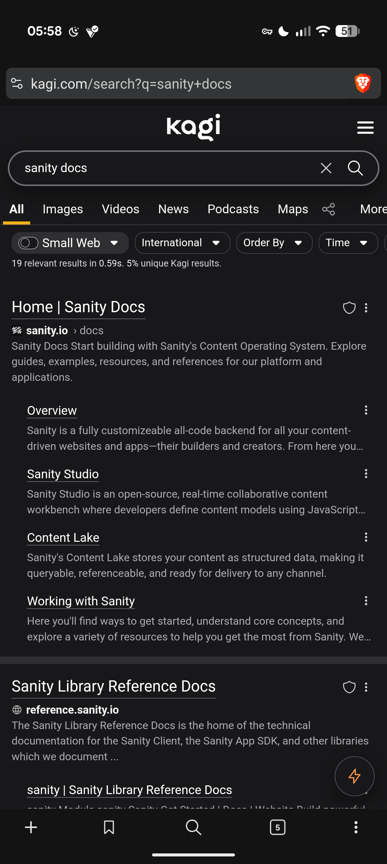
I registered here because I was missing the quick summarize. I still do not know where this feature went. I can't find it in the sidebar or top bar. Where did it go?
Clearly this wasn't usability tested.
Just look at my screen. Would you have noticed that this icon, placed at the furthest possible end from all other controls that filter or process search results, that is not labeled and well distinguished from the background, is the entry point for a feature that previously was labeled, immediately visible next to other controls? Half of the time that icon just blends in with image content.

Let's continue with AI: The whole point of quick summarize is to keep the slop short, not "give it more space". This is one the biggest problems with LLMs, they just overwhelm with unnecessary text.
The other issue with LLMs is that they predictably weight things wrongly and hallucinate. You need a way to verify. The previous interface allowed me to do this job and very quickly jump to sources or scan them by scrolling. I do not need to "focus" on the slop exclusively. I want to contrast and compare half of the time. For me the summary is only a short outline of deeper sources. If I want a deeper summary of a single source, I use Kagi Summarize or I just visit the source
Let's assume I do care about longer summaries. Fair. The new design fails because there is no way to return to search results and then back to the summary. It always regenerates the summary once you leave it. This is not only wasteful on resources but it also works again how people read: by scanning, skimming and selectively returning to single paragraphs to dive deeper.
It seems bad design choices all along on this change. The change breaks several basic usability principles: Fitt's Law, accessibility by contrast and labeling, readability. This is before we get to discussions of value. I call this a regression, and a call to action to test these changes more thoroughly.