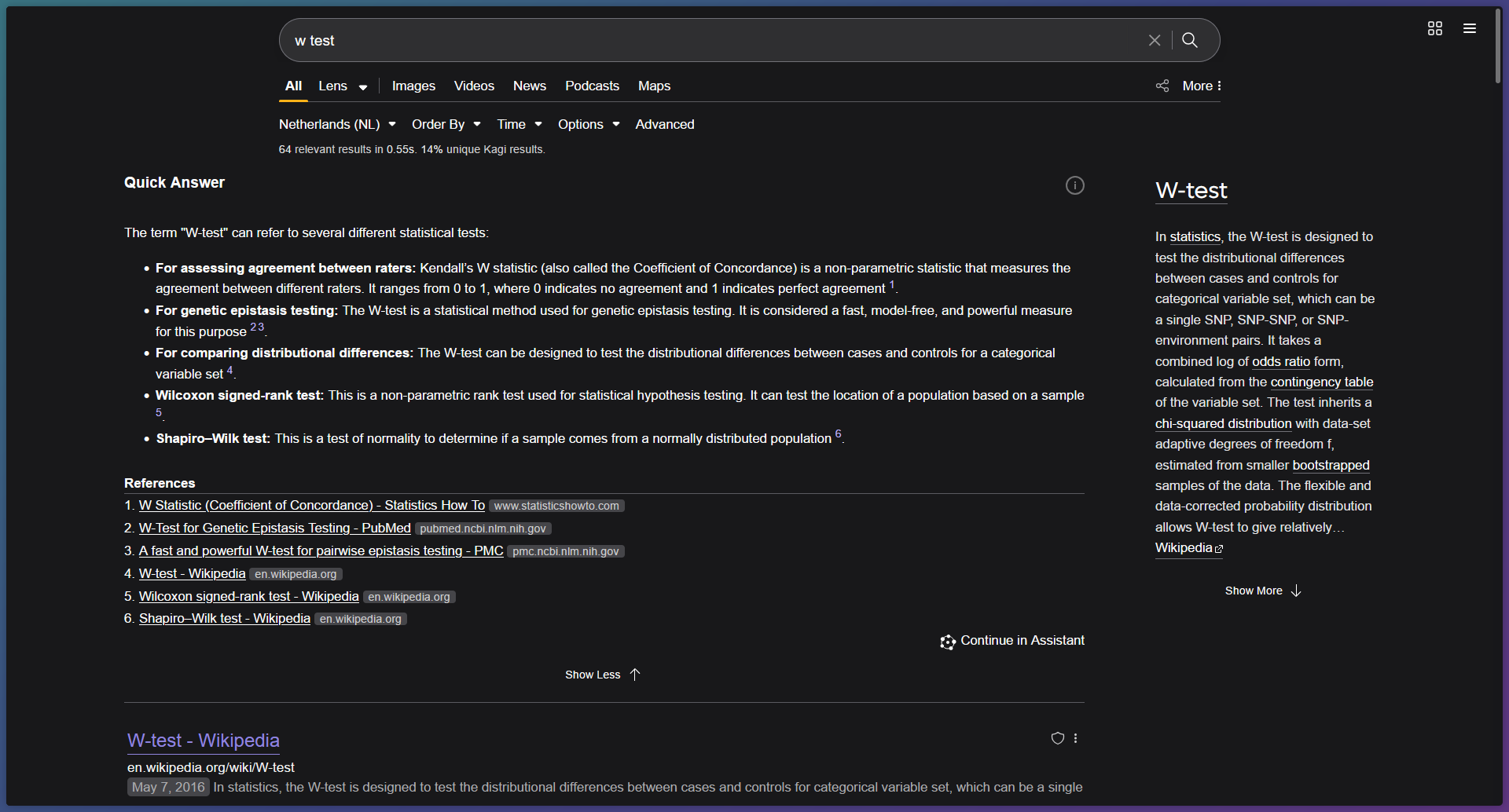
EDIT: This also breaks the dropdown/context menu's, and haven't been able to fix it while keeping the style.
Touching upon SabS reply. I took it to GenAI and let ChatGPT generate the custom CSS for me. After iterating through multiple prompts, fixes etc, I finally got a satisfying result with two "minor" missing things as far as I could find out. Which are the missing Kagi logo and favicons from websites on the web results pages.

I'm using the Zen browser with build v1.13.1b.
IMPORTANT NOTE: I'm neither a fullstack or front-end developer and everything has been created by using GenAI. I can't guarantee if this works for other resolutions, but mine is 1080p. Keep in mind that it may break other things, since that's what happens a lot with custom CSS styling.
`/* 📌 Center main container without causing overflow */
#main,
.center-content-box {
margin-left: auto !important;
margin-right: auto !important;
padding: 0 16px !important;
max-width: 100vw !important;
box-sizing: border-box !important;
overflow-x: hidden !important;
}
/* 🔍 Expand search results column to full available width */
.results-column {
flex: 1 1 auto !important;
width: 100% !important;
max-width: none !important;
min-width: 0 !important;
box-sizing: border-box !important;
padding-right: 16px !important;
}
/* ⚡ Constrain right-hand column / Quick Answer panel */
.right-content-box,
.side-panel {
flex: 0 0 320px !important;
width: 320px !important;
max-width: 320px !important;
min-width: 320px !important;
box-sizing: border-box !important;
}
/* 🧱 Results + right panel layout container */
.center-content-box._0_content-area.results-box {
display: flex !important;
flex-direction: row !important;
justify-content: space-between !important;
width: 100% !important;
max-width: min(1600px, 100vw) !important;
padding: 0 !important;
gap: 16px !important;
box-sizing: border-box !important;
overflow-x: hidden !important;
}
/* 🧼 Override legacy content-restricting wrappers */
.app-content.main-app-content,
div#_0_app_content {
max-width: 100vw !important;
width: 100% !important;
overflow-x: hidden !important;
}
/* ✅ Position footer correctly beneath results and aligned with results-column /
.footer-search-results {
flex: 0 1 auto !important;
width: calc(100% - 320px - 16px) !important; / total width minus right panel and gap */
max-width: calc(100% - 320px - 16px) !important;
box-sizing: border-box !important;
margin-top: 24px !important;
margin-left: 0 !important;
align-self: flex-start !important;
overflow: visible !important;
}
/* 📎 Properly scale footer sublayout such as “Share this Search” */
.copyToClip,
._0_share_url_footer.clipboardcopy {
flex: 1 1 auto !important;
min-width: 0 !important;
max-width: 100% !important;
box-sizing: border-box !important;
justify-content: center !important;
align-items: center !important;
}
/* 🧱 Ensure main behaves as reliable layout control point */
main#main {
display: flex !important;
flex-direction: column !important;
flex-wrap: nowrap !important;
overflow-x: hidden !important;
max-width: 100vw !important;
box-sizing: border-box !important;
}
/* 🔧 Resolve top-of-page overflow issues (logo, searchbar, tabs) */
header,
.app-box-center,
div.header-search-results {
overflow-x: visible !important;
overflow-y: visible !important;
flex-shrink: 0 !important;
min-width: 0 !important;
box-sizing: border-box !important;
}
/* 🎯 Ensure logo remains visible and doesn't shrink /
.kagi-logo,
.logo,
div[class="logo"] {
display: block !important;
max-width: 100% !important;
height: auto !important;
flex-shrink: 0 !important;
visibility: visible !important;
}
/* 🧱 Prevent scrollbars on search input and tab rows */
.search-bar,
.tab-bar,
.lens-tabs,
.header-search-results {
overflow: visible !important;
width: auto !important;
max-width: 100% !important;
white-space: nowrap !important;
flex-wrap: wrap !important;
}
/* 🧼 Normalize search results container */
.results-column {
overflow: visible !important;
max-width: 100% !important;
min-width: 0 !important;
flex-shrink: 1 !important;
}
/* ⛔️ Remove hard overflow on ancestors */
body, html {
overflow-x: hidden !important;
overflow-y: auto !important;
}
/* 🧭 Preemptively scale layout wrappers correctly */
.0_app_content,
.0_content-bay,
.app-content-box,
#_0_app_content {
min-width: 0 !important;
width: 100% !important;
max-width: 100vw !important;
overflow-x: hidden !important;
box-sizing: border-box !important;
}
/* 🛠️ Remove cumulative padding from main and center-content-box */
main#main,
main.center-content-box,
main._0_content-area,
main.results-box {
padding: 0 !important;
margin: 0 auto !important;
max-width: 100vw !important;
overflow-x: hidden !important;
box-sizing: border-box !important;
}
/* 🔍 Fix duplicate center-content-box outside <main> */
body > .app-box-center > .center-content-box {
padding: 0 !important;
margin: 0 auto !important;
max-width: 100vw !important;
overflow-x: hidden !important;
box-sizing: border-box !important;
}
/* 🧱 Constrain flex-row layout to viewport */
.center-content-box._0_content-area.results-box {
width: 100% !important;
max-width: 100vw !important;
overflow-x: hidden !important;
box-sizing: border-box !important;
}
/* 🧼 Preemptively correct direct children of <main> */
main#main > * {
min-width: 0 !important;
flex-shrink: 1 !important;
overflow-x: hidden !important;
box-sizing: border-box !important;
}
/* ✅ Only correct header/top-panel center-content-box */
header .center-content-box,
.top-panel-box .center-content-box,
.app-header .center-content-box,
.app-content > .center-content-box:not(._0_content-area) {
overflow-x: hidden !important;
max-width: 100vw !important;
width: 100% !important;
box-sizing: border-box !important;
padding-left: 16px !important;
padding-right: 16px !important;
margin-left: auto !important;
margin-right: auto !important;
}
/* 🎯 Fix vertical overflow in header/top-panel .center-content-box */
.top-panel-box-inner > .center-content-box,
.app-content > .center-content-box:not(._0_content-area) {
overflow-y: hidden !important;
overflow-x: hidden !important;
height: auto !important;
min-height: unset !important;
max-height: none !important;
flex: 0 1 auto !important;
box-sizing: border-box !important;
align-items: center !important;
}`
Maybe the Kagi developers can further build upon this!