What currently happens
When I search for a phrase, Kagi returns results. However, it is not immediately apparent how I can upvote, or downvote a particular result, to train Kagi on my preference.
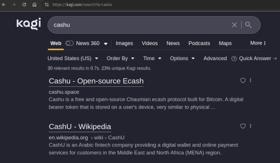
There is a way to provide feedback to Kagi if I want none, less, or more results from a particular source, and this feels and is hidden. I suspect that this friction by design significantly reduces result upvote/downvote/feedback.
This is a missed opportunity to spin the flywheel of customer feedback.
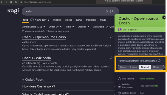
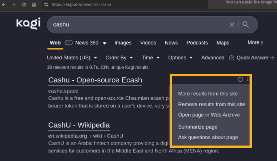
Suggestion
Make providing feedback as easy as hitting the "like" button on any mainstream consumer app - YouTube, Facebook, etc. The like button should always be visible immediately adjacent to a search result. Examples:
YT 
FB 
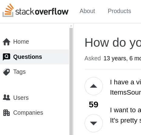
Ideally, similar to Stackoverflow, there is:
1) a upvote button
2) a downvote button
Mockup
Below are a couple mockups, where I have revealed the upvote/downvote buttons from their current hiding spot.
A) thumbs

B) arrows
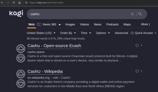
Hypothesis
By removing the cloak of the upvote, and downvote buttons, this simple UI change will increase results upvote/downvote/feedback by an order of magnitude.
In turn, this will make Kagi more valuable to the Kagi enjoyer, and possibly to other Kagi enjoyers.
Upvoting, and downvoting, unlike advertisements, is always opt-in.
User Flow
1) user searchs for a phrase
2) user sees results
3) user upvotes results, or user downvotes results