For a long time, Kagi has had variations of doggo on the pricing page:

In short, the higher the plan, the more actively doggo chases the ball.
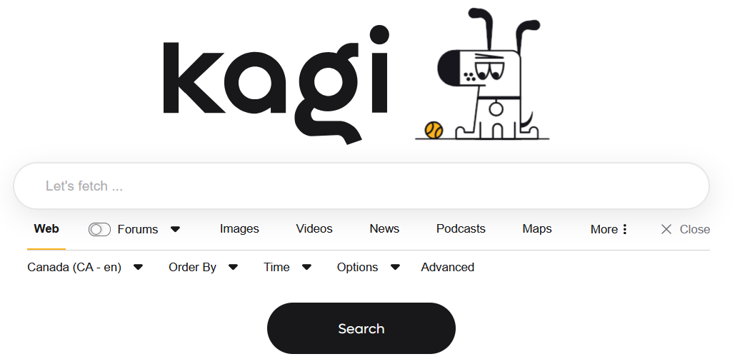
Despite this, Kagi's home page always has the same doggo; the one matching the trial plan.

This is a purely aesthetic change, but it would be cool if the doggo on the homepage matched the doggo on the pricing page. This is to say that ultimate users get to see a spinning doggo, professional users a floating doggo, starter users a sniffing doggo, etc. Of course, these would all remain static images
This feature is purely aesthetic and playful; that is its primary purpose.
One minor additional functionality is that it provides immediate feedback to users who have accidently logged in with a wrong account (something I have done a handful of times).