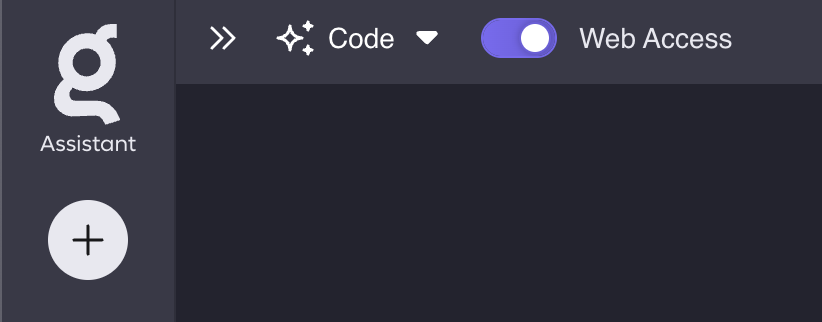
The Kagi logo in The Assistant is confusing to me.
I understand the "plus" button making a new thread and that is what I would expect.
However, I would also expect to be able to click the logo to create a new thread (but that takes me to kagi.com not kagi.com/assistant).
I'm not sure how I would change this overall design, but it often confuses me.