I am deeply disappointed with the assistant redesign and the lack of basic UI principles. This is a hard regression on previous behavior and usability.
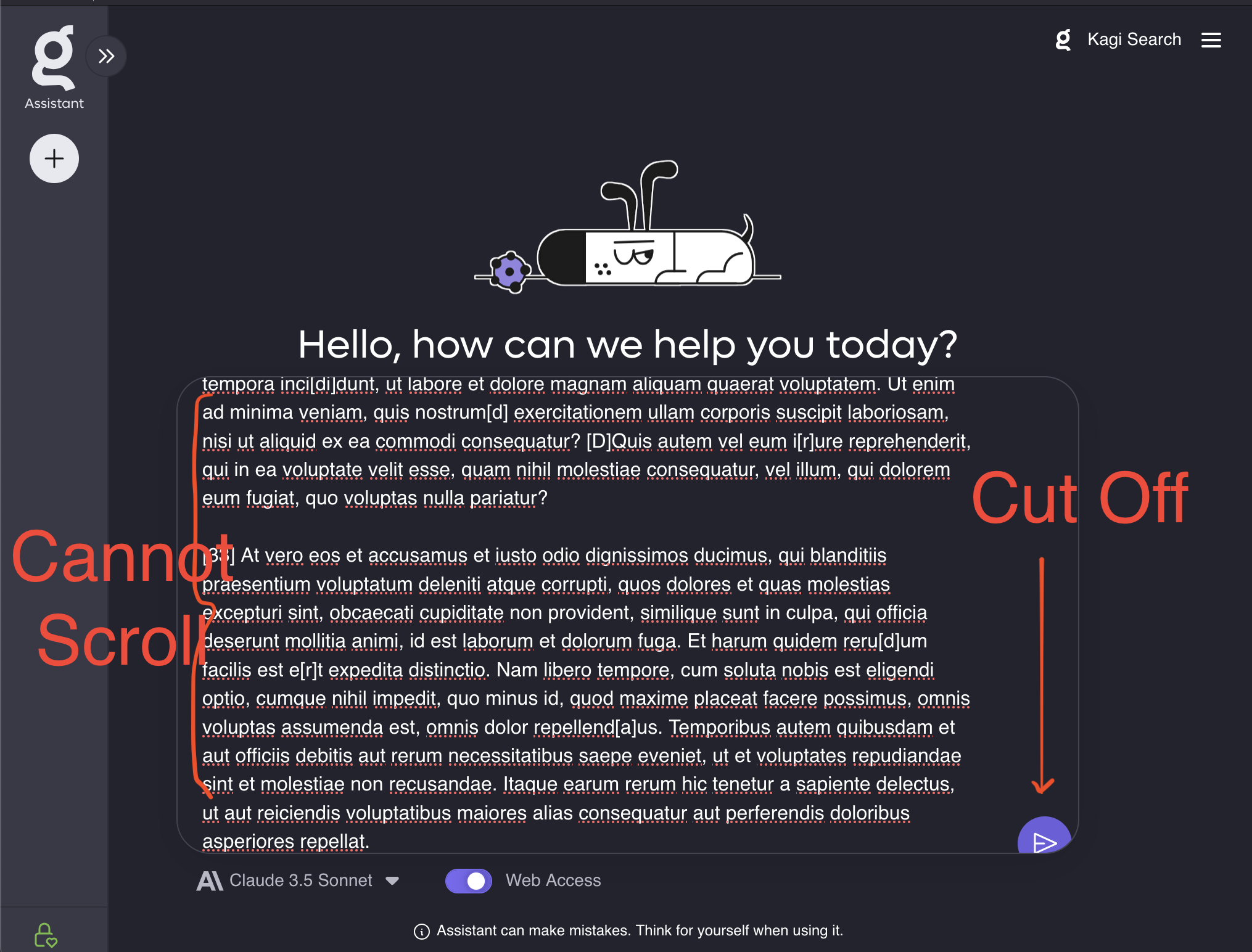
The prompt box does not appropriately handle text of more than a few lines is added. It is not possible to scroll, so if I want to edit I have to arrow keys to get my cursor in place. This is unusable for large prompts.
If I do go to the top to edit the prompt the submit button no longer shows on the screen, so now I have to use arrow keys to get it back
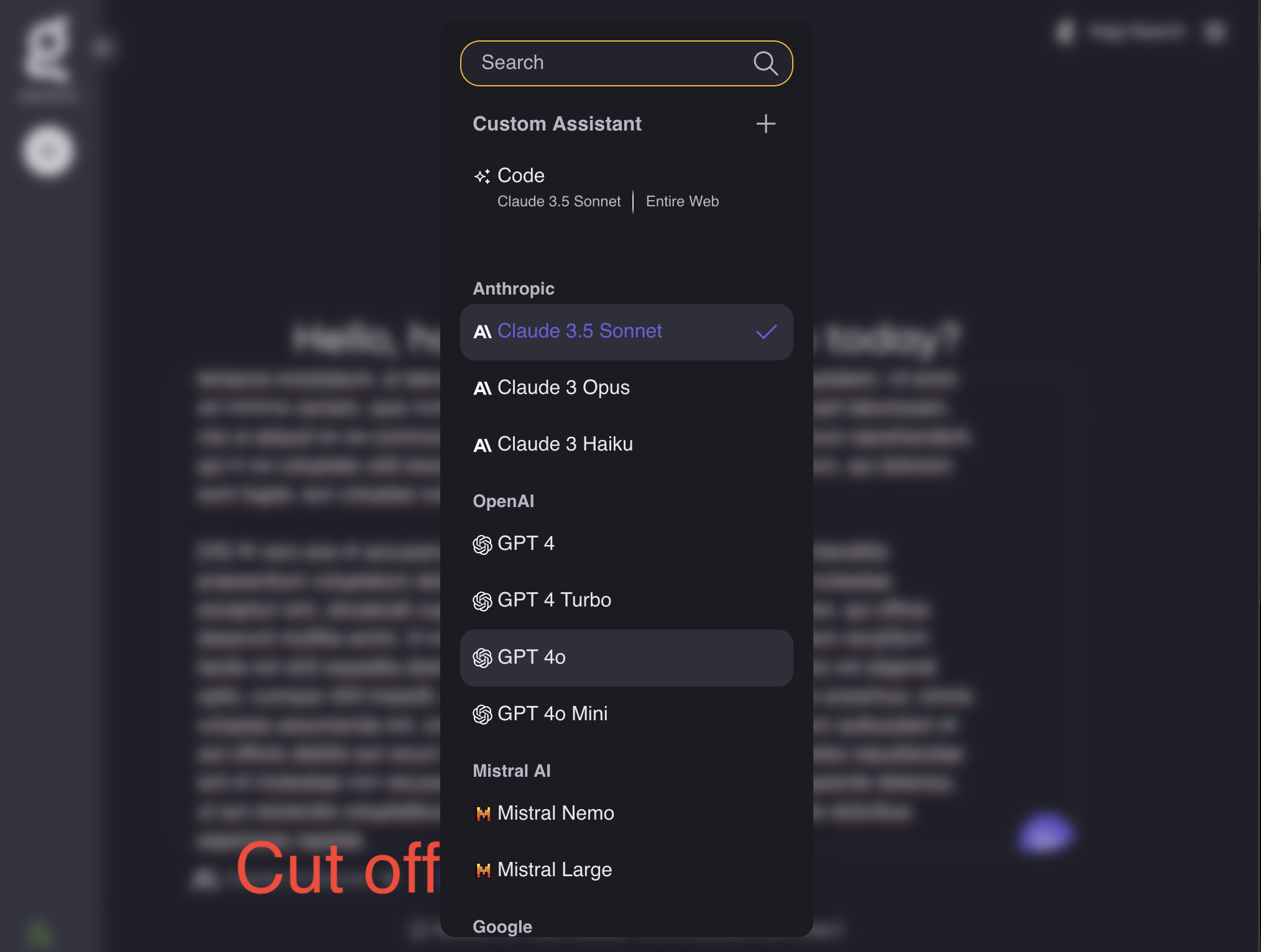
The list of models is now unnecessarily large to the point where it is off screen. I'm not sure why this was deemed as better given there's no additional information from the previous design, just making the text so large it doesn't fit on the page.


Make the prompt box so I can scroll when the text does not fit the vertical width
Make the prompt box properly show the submit button for large prompts
Make the model list fit on the page