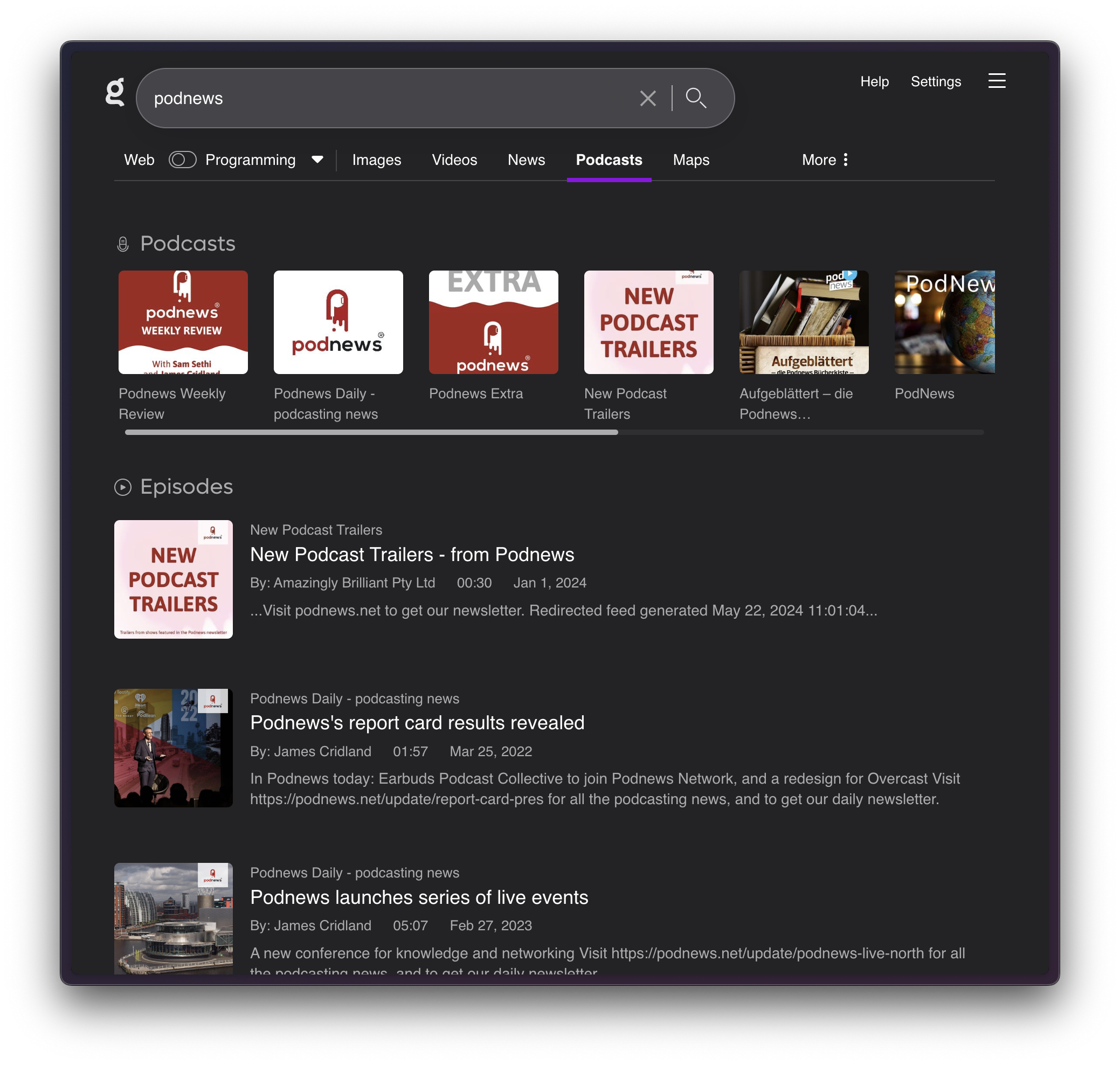
In podcast searches, the "Podcasts" rail at the top of the screen shows images at 120px by 96px. Podcast thumbnails are always square, and by showing them at a non-standard 5:4 aspect ratio, it means text and artwork may be truncated in this rail.
Below, you'll see an example where the handsome and really rather good co-host of the Podnews Weekly Review, James Cridland, has his name chopped off in the search result image. I'm not sure he's entirely happy about this.

I expect them to show square, like the episode data beneath, so that the podcast thumbnails do not cut off text.
My suggestion is to always show those as 96px by 96px (or 120px by 120px) to retain the square aspect ratio. The CSS to change is below: you'll want to match the width and height.
.top_podcast_item_thumb {
width: 120px;
height: 96px;
border-radius: 5px;
}
You may wish to use 110px as the size in the rail; this would match the size in the Episodes data.