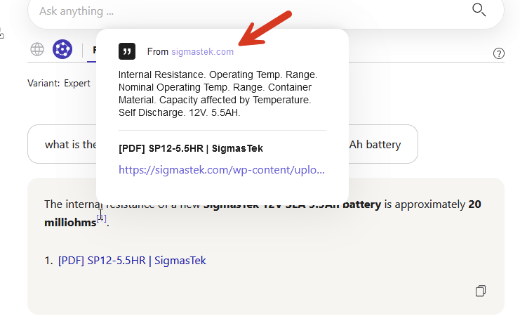
Oh, my mistake, for some reason, I thought that was the summary (or description provided by the website). The quote icon didn't even register in my mind that the top section was a quote. Some sources don't have a tooltip at all - so I just thought it was a knowledge graph deficiency thing (and not the LLM couldn't take a section out of the page).
I think this solves my original issue.
Aside, regarding the UX, I wonder if something like this would self-document this feature.

It would make this a bit more noisy, but I think that might be unavoidable, given the quote is going to be unstructured text. The benefit would be a more direct conceptual path.