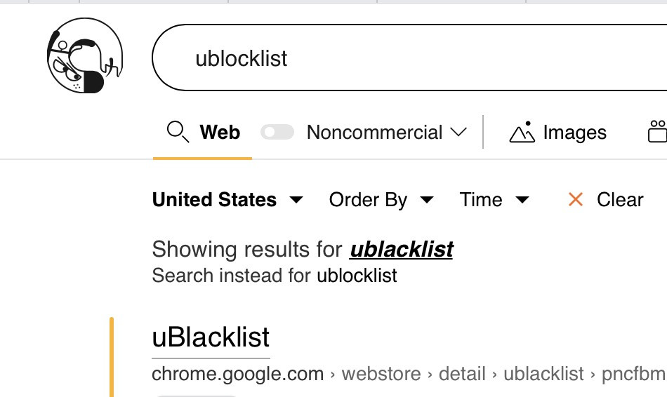
Call me whatever, but when getting query suggestions, often it's hard for me to notice what exactly was changed and I have to stare at both queries for at least 5 seconds.

(1) If the correction highlighted the difference (preferably with color), e.g. uBlocklist or uBlacklist, it would be obvious at first glance.

For the same reason often I'm initially unsure if my query was actually changed to the suggestion or not. I would therefore prefer a more clear message when it comes to what I have to click to search for my original query again, e.g. instead of "Search instead for ..." (because this sounds like a difference to what I entered, when in fact it's my original query) something like "Revert query to ..." would be more clear IMO