(I marked this as bug, since it's a regression)
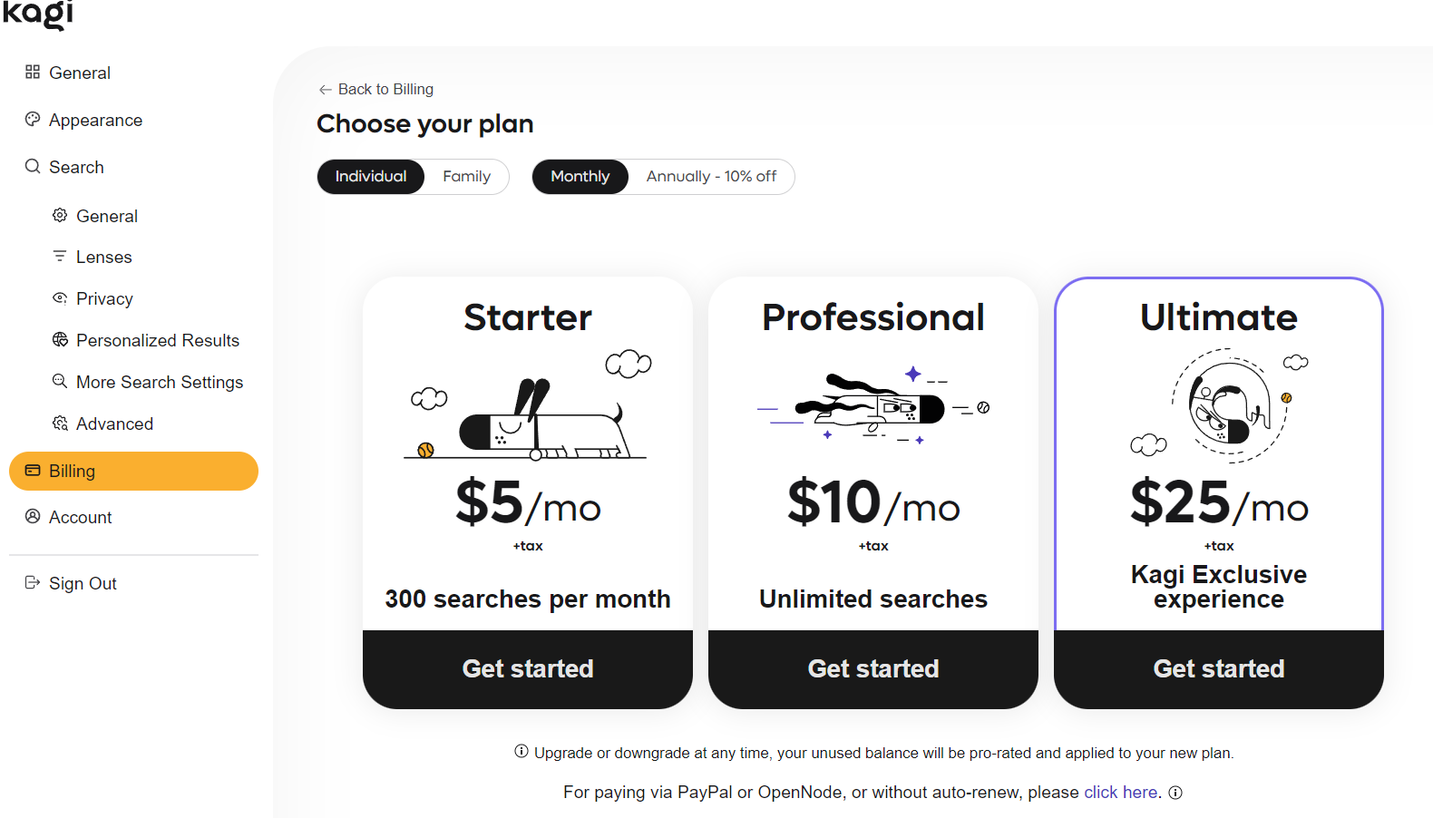
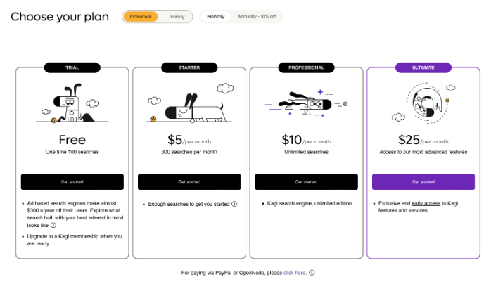
Was going to change from a trial to a paid plan and the new UI that I got to see starting today all of a sudden doesn't show anymore what the plan differences are. As such, I can't decide what plan to switch to.
See attached images for before and after comparison:
After 
Before:

I highly suspect that this will reduce user conversion a lot and should be addressed.
All plans to show the details of what they offer.