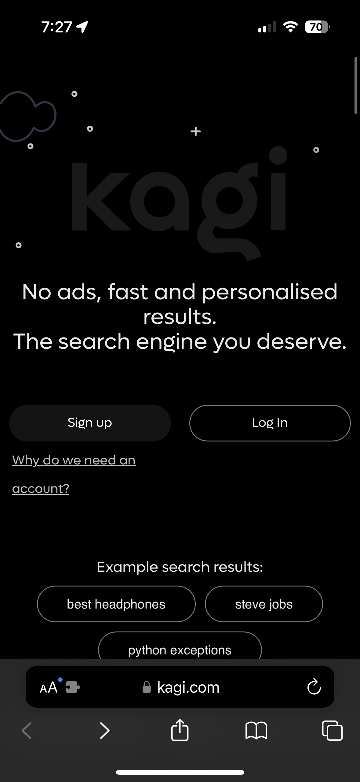
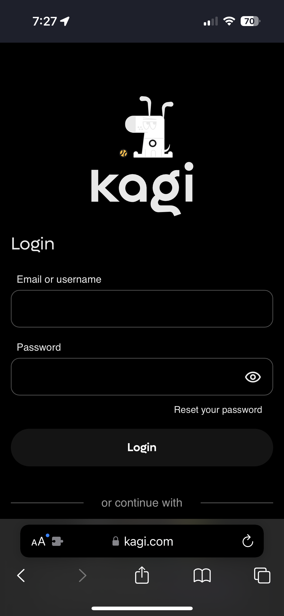
Currently, whenever a user signs into Kagi, they must go through two pure white webpages in order to access the service, regardless of their OS’s color scheme preference.
This is mostly an issue late at night, when having 95% of your screen unexpectedly output its maximum value into your fully dilated pupils can evoke a less than positive response.
This might seem like a small issue, since for many users the sign-in process is only needed occasionally. But since Kagi was created with privacy as a core feature and selling point, I’m sure a significant subset of Kagi users are mindful of their browser fingerprint and clear their history / cookies regularly. Requiring them to go through the sign in process the next time they search something or open a new tab.
Now to address the issue / solution that many would likely bring up: “What about all the other white websites that lack dark mode support?” This is what dark mode extensions are for. The issue is they mess with the theming of websites, often making them look much worse than their native dark modes. Here are what Kagi’s Landing and Sign-in Pages look like with Noir for example:


I don’t think downgrading the appearance of Kagi generally, just to avoid the sign-in page flashbang is a good solution. Especially for a paid service that is inherently one of if not the most frequent websites its users interacts with.
I know you guys are a small team and have lots of niche requests and feedback from users and must pick what to prioritize. But I think this would genuinely provide a usability improvement and increase the visual coherence of the site. There’s also the bonus that prospective users visiting the site who have their OS set to dark mode are likely to be more enticed by a site that visually aligns with their preferences.