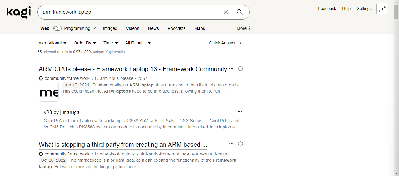
Currently, the search result settings like "Order By" and "Time" take 2+ clicks to set, and consume valuable vertical space.
Also, users are not aware search tools like "verbatim" and "personalized" exist. Or if they do, they cannot quickly tell if they are set or not.
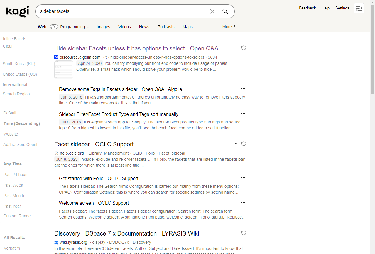
Moving these to a sidebar on the left would reduce clicks and save vertical space. Also the available search tools are surfaced and current settings are clearly visible:

CSS breakpoints should be set so if the user's window is too narrow, the current settings menus are shown instead of the sidebar.
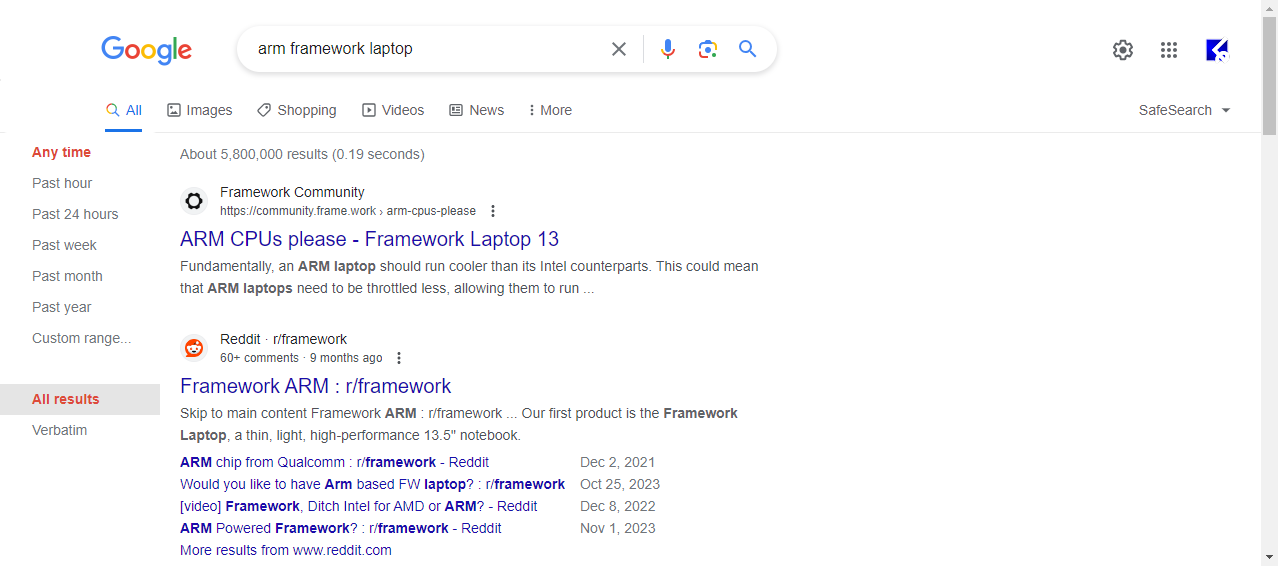
There is a user script to restore the Google left-hand sidebar:
- Only one click to change setting
- Can see possible options without clicking
- Some vertical space regained

Compare to Kagi:
- At least two clicks required to change a setting.
- Can't see options until setting name clicked.
- Settings uses up valuable vertical space.
- Horizontal space is wasted.

Some of Kagi's search settings are very long (like the region setting):
- Limit max vertical size for facets; scrolling when required. (Like how region setting already scrolls.)
- Show the top 3, then "Search Region..." opens up a search modal
Of course Kagi Images, Videos, News, and Podcasts should also use sidebars with facets, too.