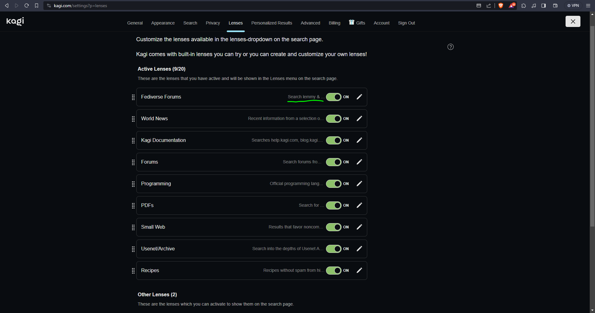
There is a minor issue in Kagi settings UI - all lens descriptions are truncated, even though there is a lot of space available.
I'm using Brave browser
on Windows.
The UI shouldn't truncate text when it's not necessary. All descriptions of the lenses should be fully visible when there is room for full text.