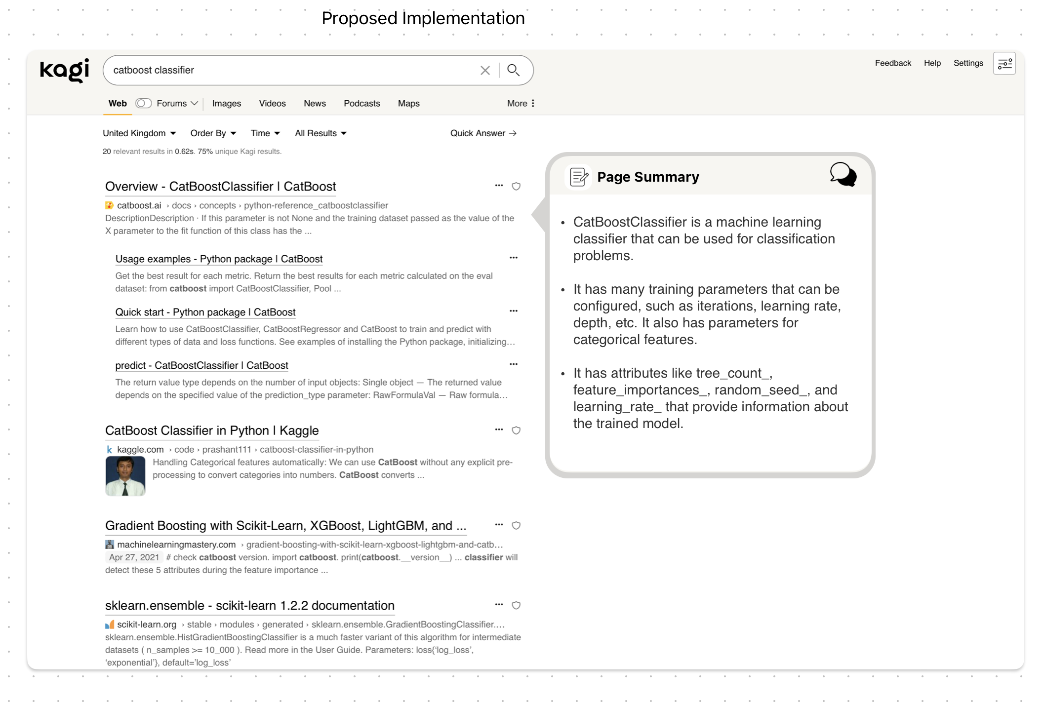
Vlad At the moment, the current implementation leaves a lot of empty space, example screenshot below, which I think can be made better use of.

My proposed implementation, screenshot below, would be to add something in the form of either a bubble or a card that is in line with the link that is being summarised which avoids having the rest of the results being pushed down. In the case where there are already cards like a summary from wikipedia, I think it will be fine to push those down instead as I assume the normal workflow for a user would be to use the page summariser assuming whatever was on the search page did not already give them what they were looking for. This would also allow multiple page summaries without constantly shifting the search results. *the mockup is only a very rough sketch, I'm sure it can look a lot nicer and feel less out of place with more time and polish.
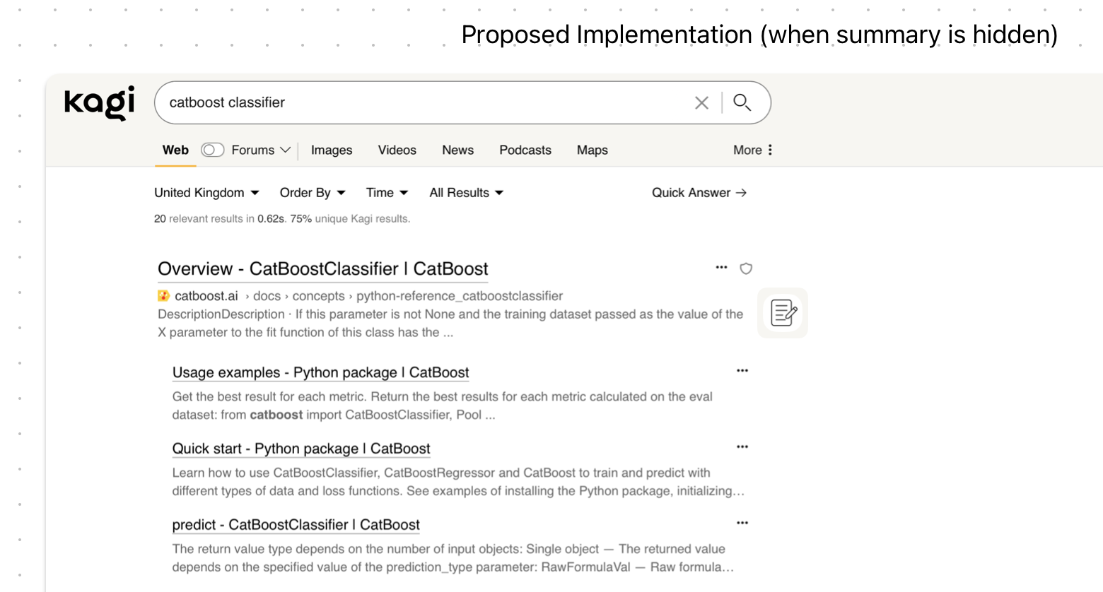
If a user wanted to minimise the page summary, they could click on the summary icon which will leave just the icon next to the link that they can open up if they wish to revisit the summary. Alternatively, if they wish to discuss the document further, they could click on the chat icon in the top right of the summary box which can move the box to a chat-box style window in the bottom right, similar to the experience when drafting a new email in gmail. I think this will make for a more intuitive UI, especially since it doesn't take the user away from the search results and into a new window.

