This is a rather nitpicky suggestion, and it is something I'd categorize as going the extra mile to polish the look of the weather widget even further.
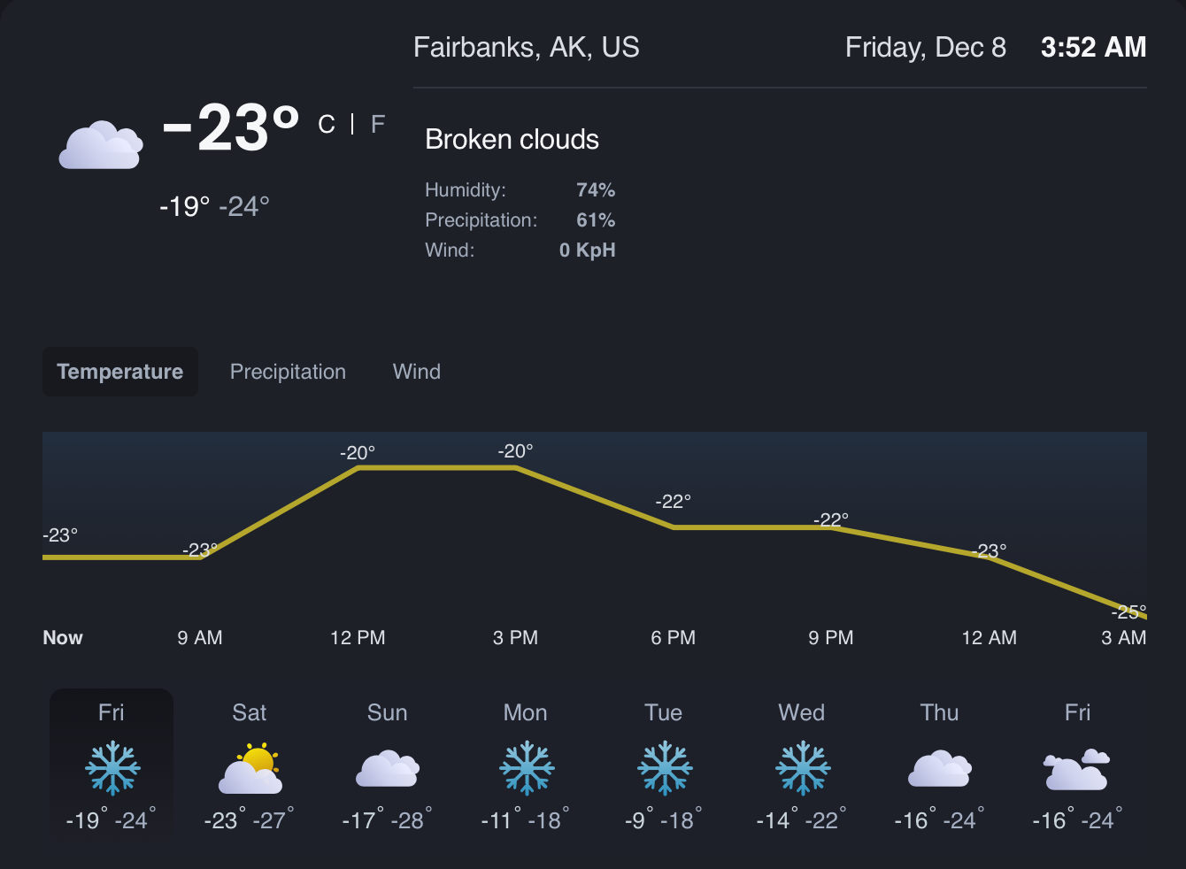
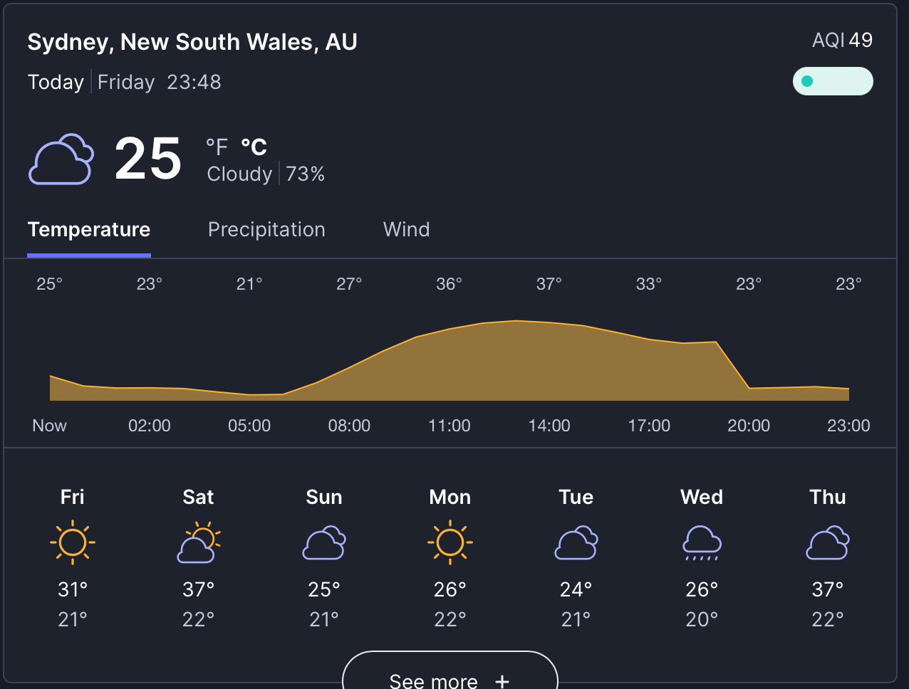
Currently, the weather widget uses the yellow/orange color for the temperature graph, no matter what the temperatures are:
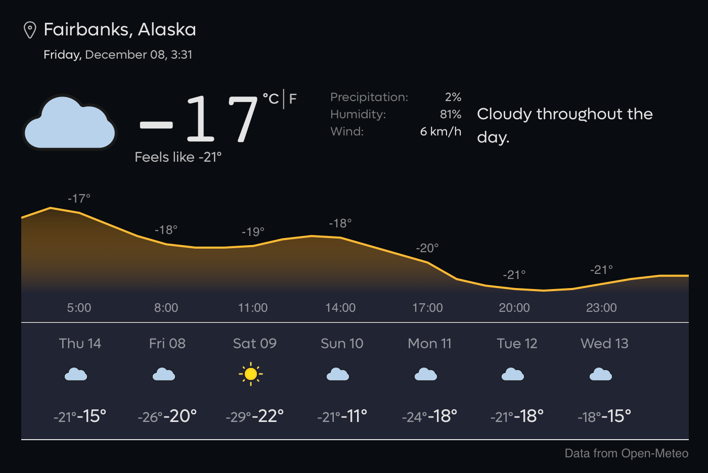
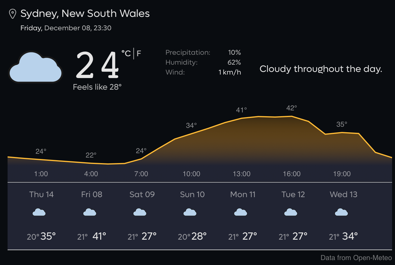
I'd like to see the color of the grapth adapt to the results. In the examples above, Fairbanks, Alaska should be in light blue (a color we often associate with cold), and Sydney, Australia could be in red to emphasize the extreme temperatures they're currently experiencing.
This would enhance the "at a glance" information value the widget provides.
Some suggestions for colors:
Below -20°C #001040
-20°C – -10°C #003399
-10°C – 0°C #0099FF
0°C – 10°C #66FF66
10°C – 20°C #FFFF09
20°C – 30°C #FF6600
Above 30°C #E50000
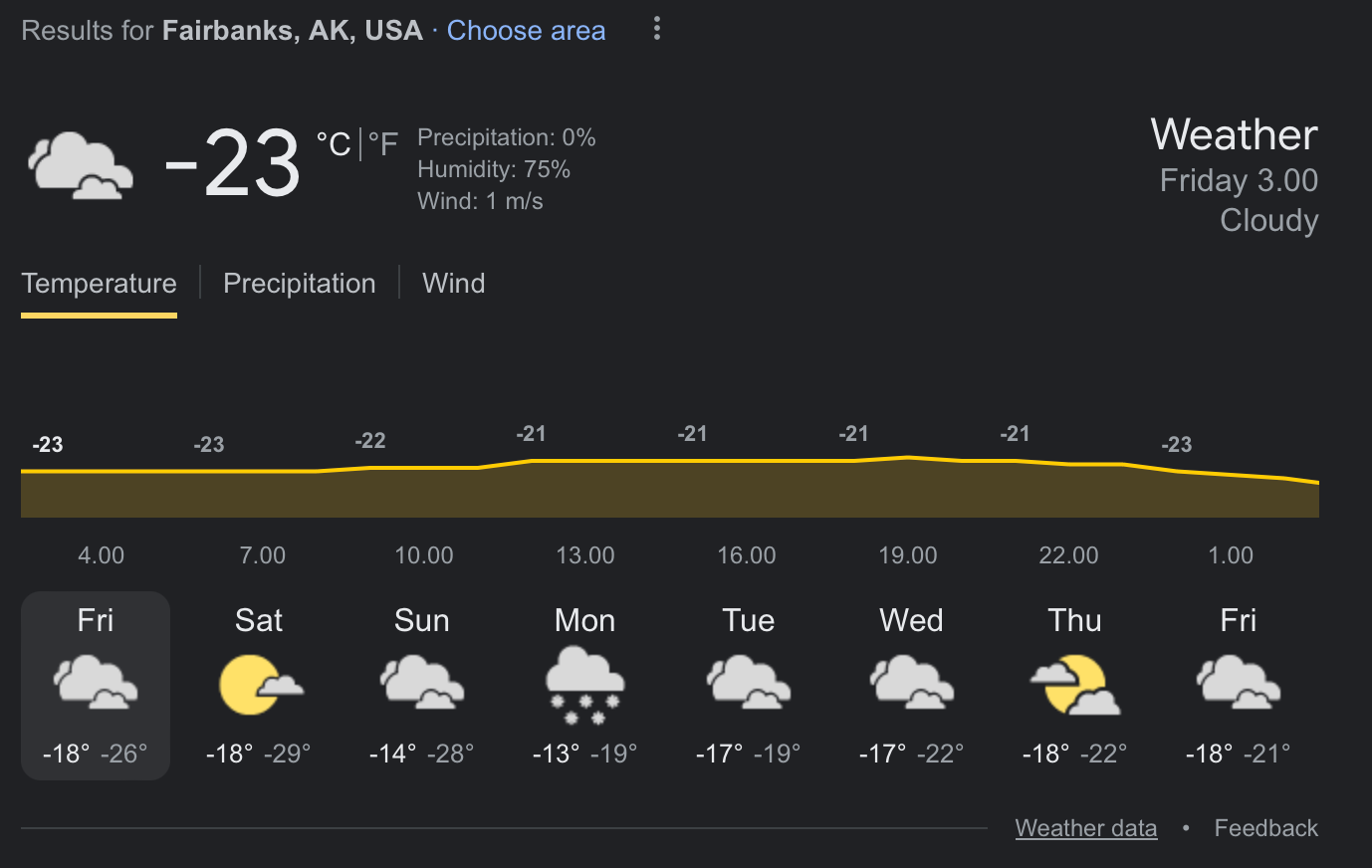
Other search engines also use a yellow graph for every situation, and it'd be beneficial for Kagi to differentiate itself from the likes of Google or Brave:
Google's implementation:
Brave:
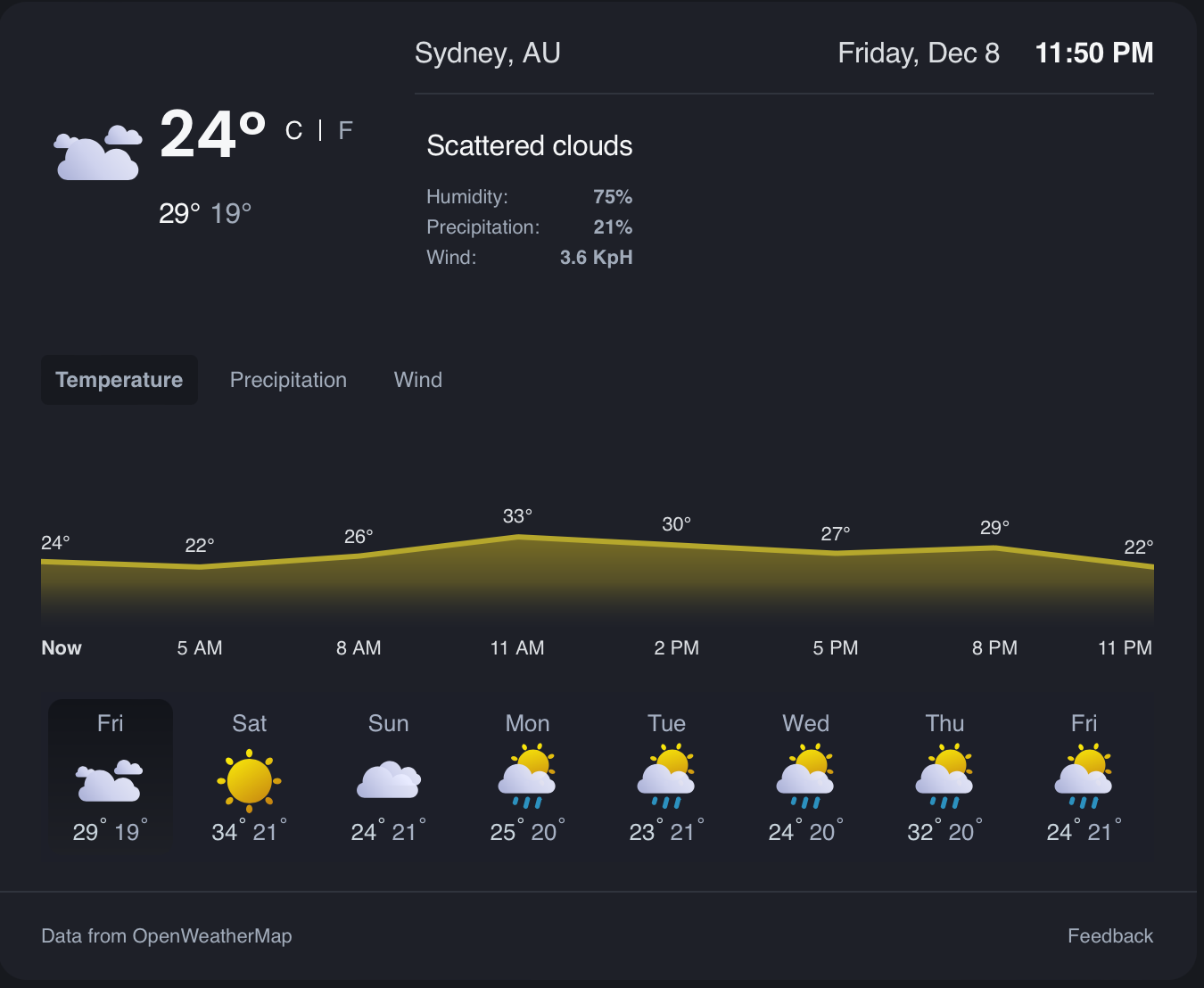
it's also worth noting Brave has a bit of blue in the background when the temperature is cold:
Startpage:
Implementing this comes with some problems that need solving. For instance, what color should be used in the following graph?
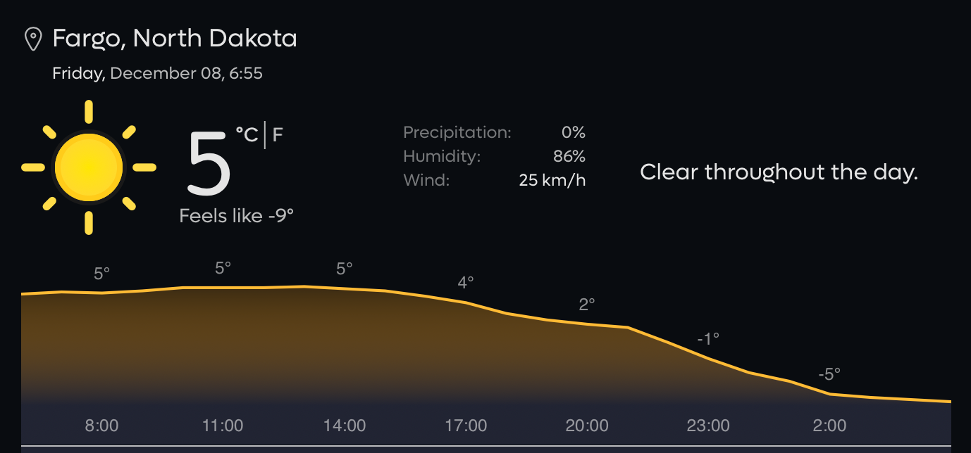
It could either be colored based on
a) the current temperature
b) the most extreme temperature of the graph (would that be +5°C or -5°C?)
c) The average value of the period of time the graph covers (the next 18 hours)
Technology for making it even more detailed exists but making the color change between each point could make the widget a messy rainbow and that is not ideal. I think one color for the entire graph is the way to go.