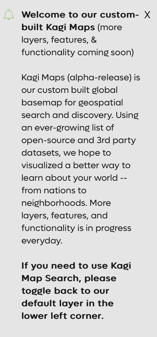
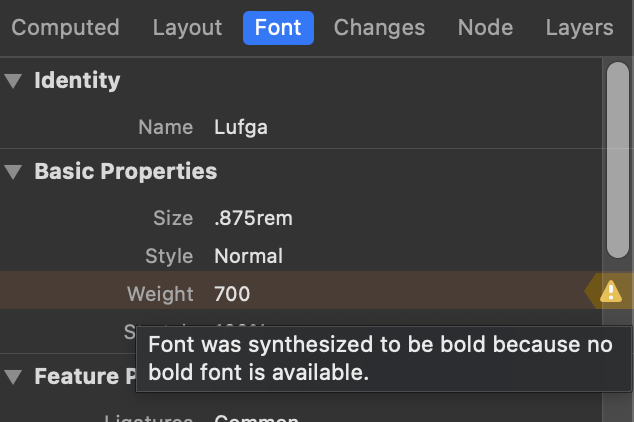
Kagi’s “brand font” appears to be Lufga. Because Kagi does not serve a bold version of this font, browsers are required to synthesize it wherever it's requested, which does not look as nice as a true bold font.


Kagi should serve or otherwise make sure that its pages fetch a truly bold version of Lufga so that the browser is not forced to synthesize it. True bolds look nicer than synthesized. (And italic too for that matter, although I don't know if I've seen Lufga in italic anywhere.)