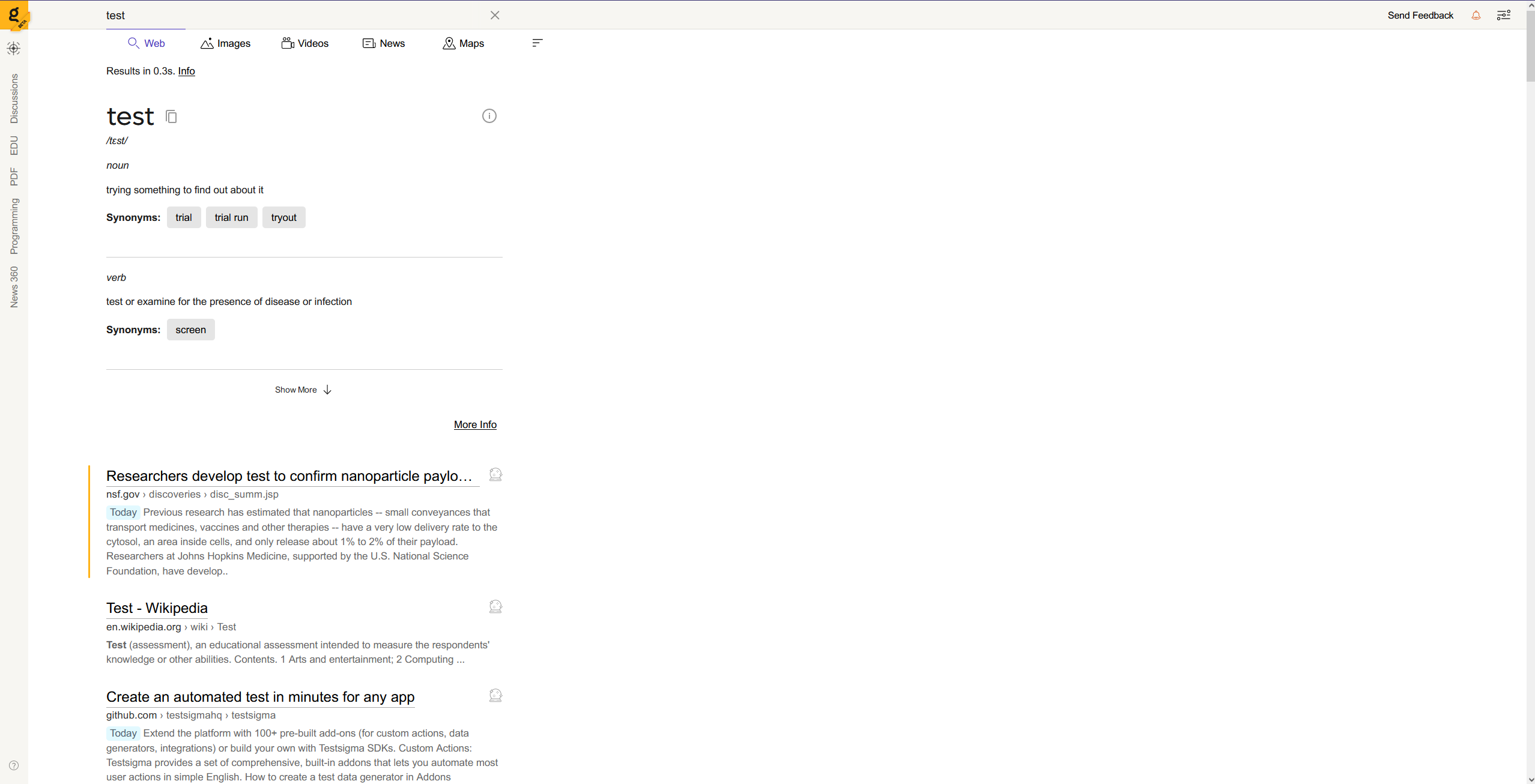
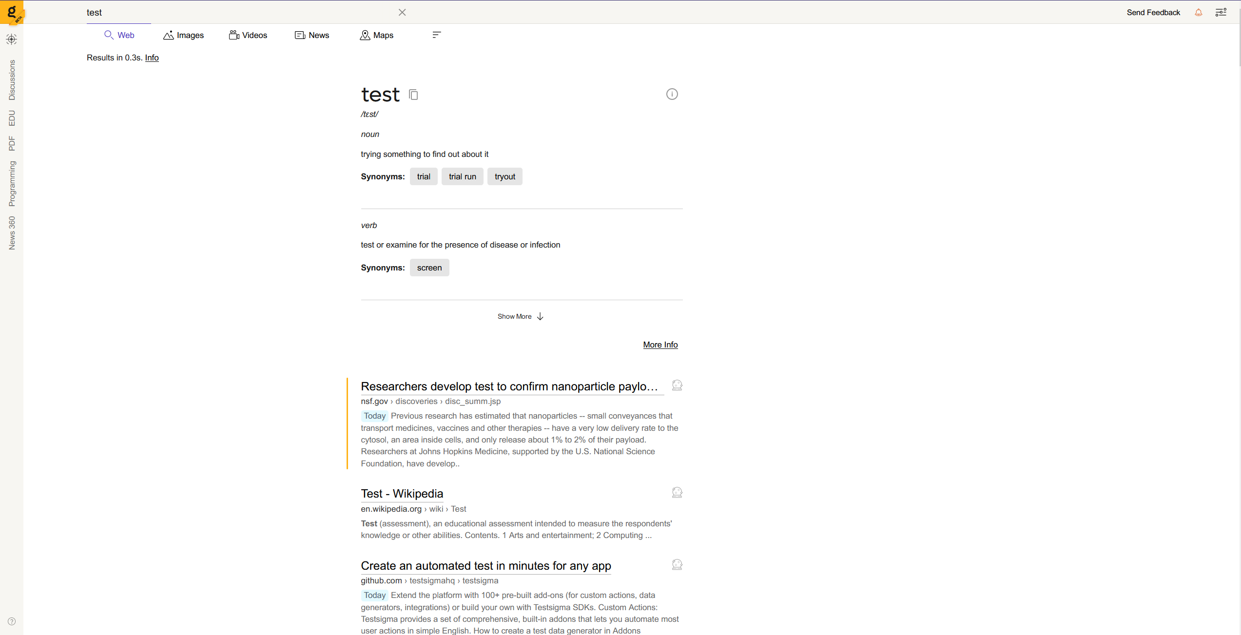
For people with larger screens, the search result is all the way on the left. Instead of fixed px for left margin, it would be better to have it by percentage or center align the content div. The larger the screen, the worse it looks.
Before:

Centered div as an idea:
