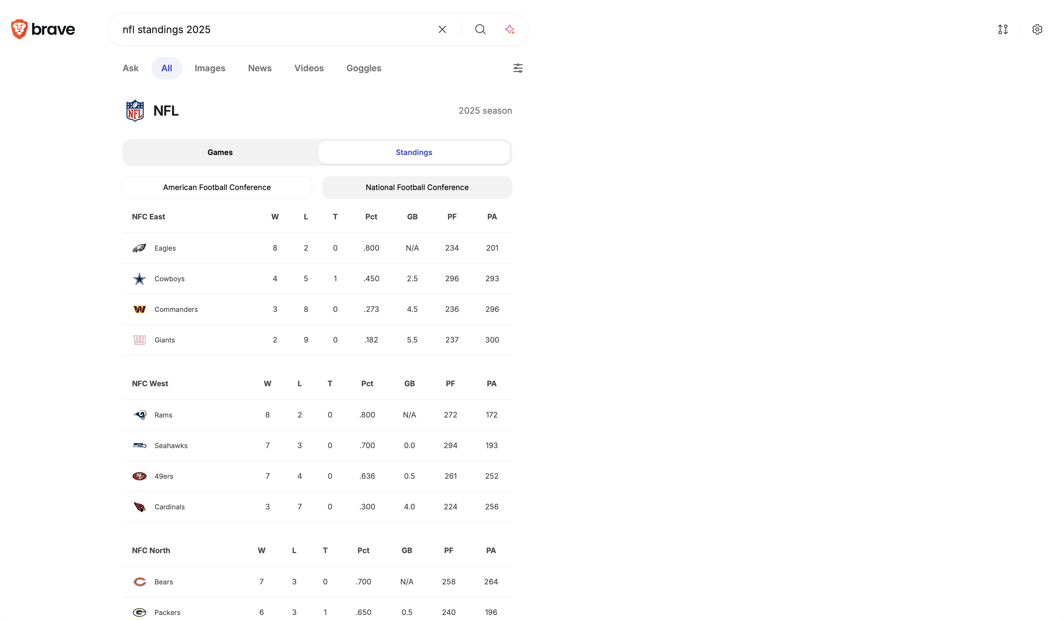
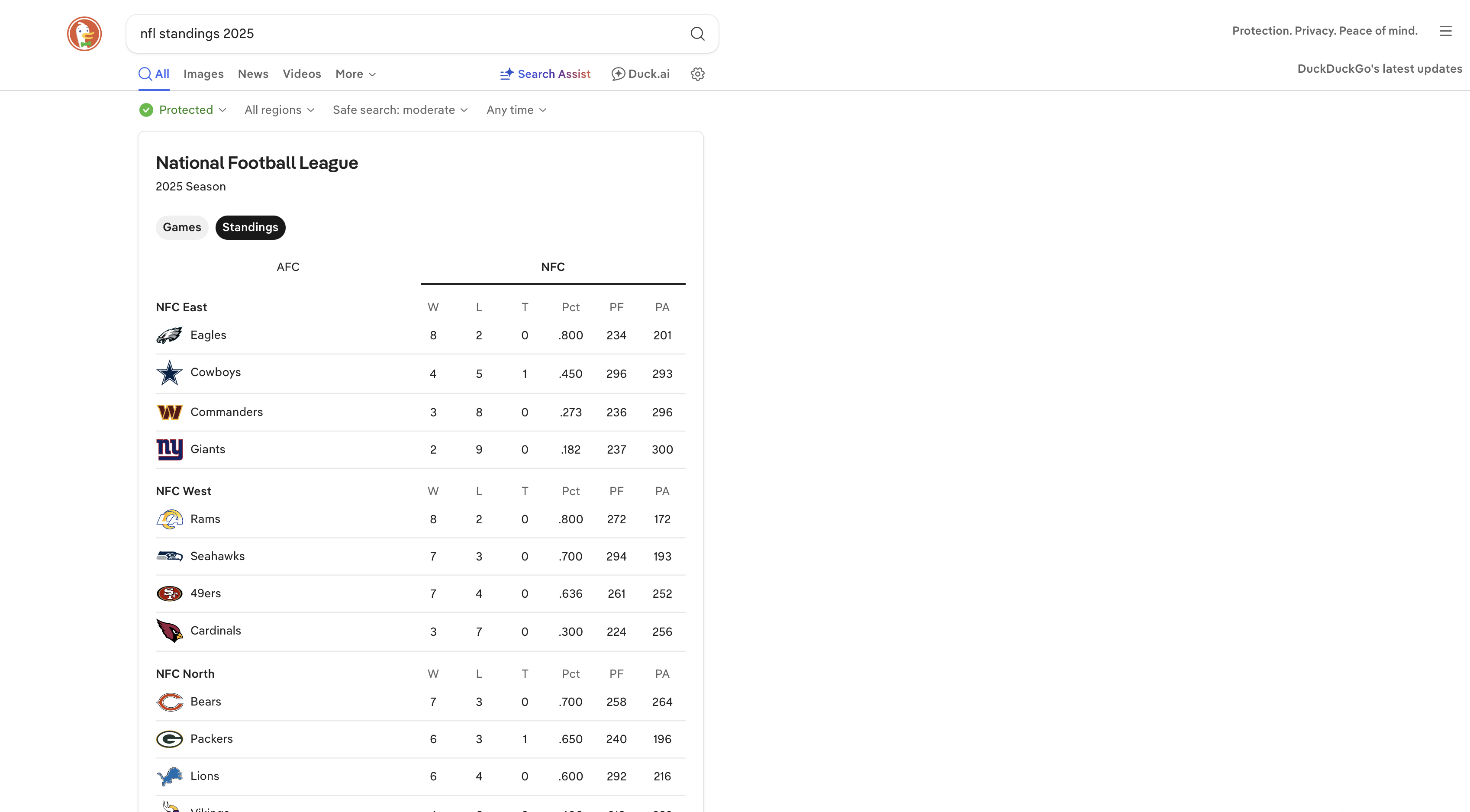
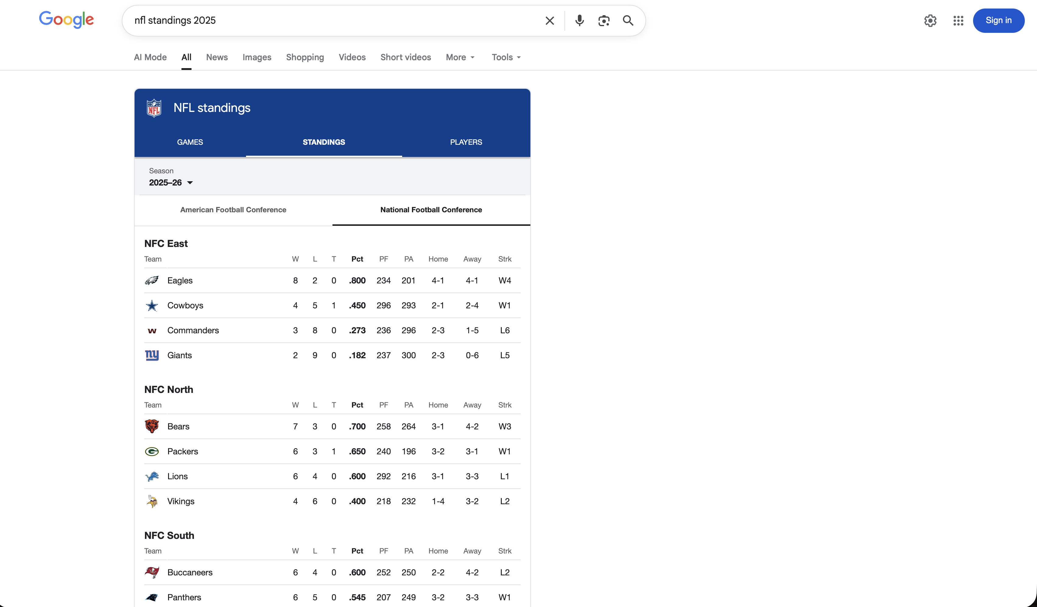
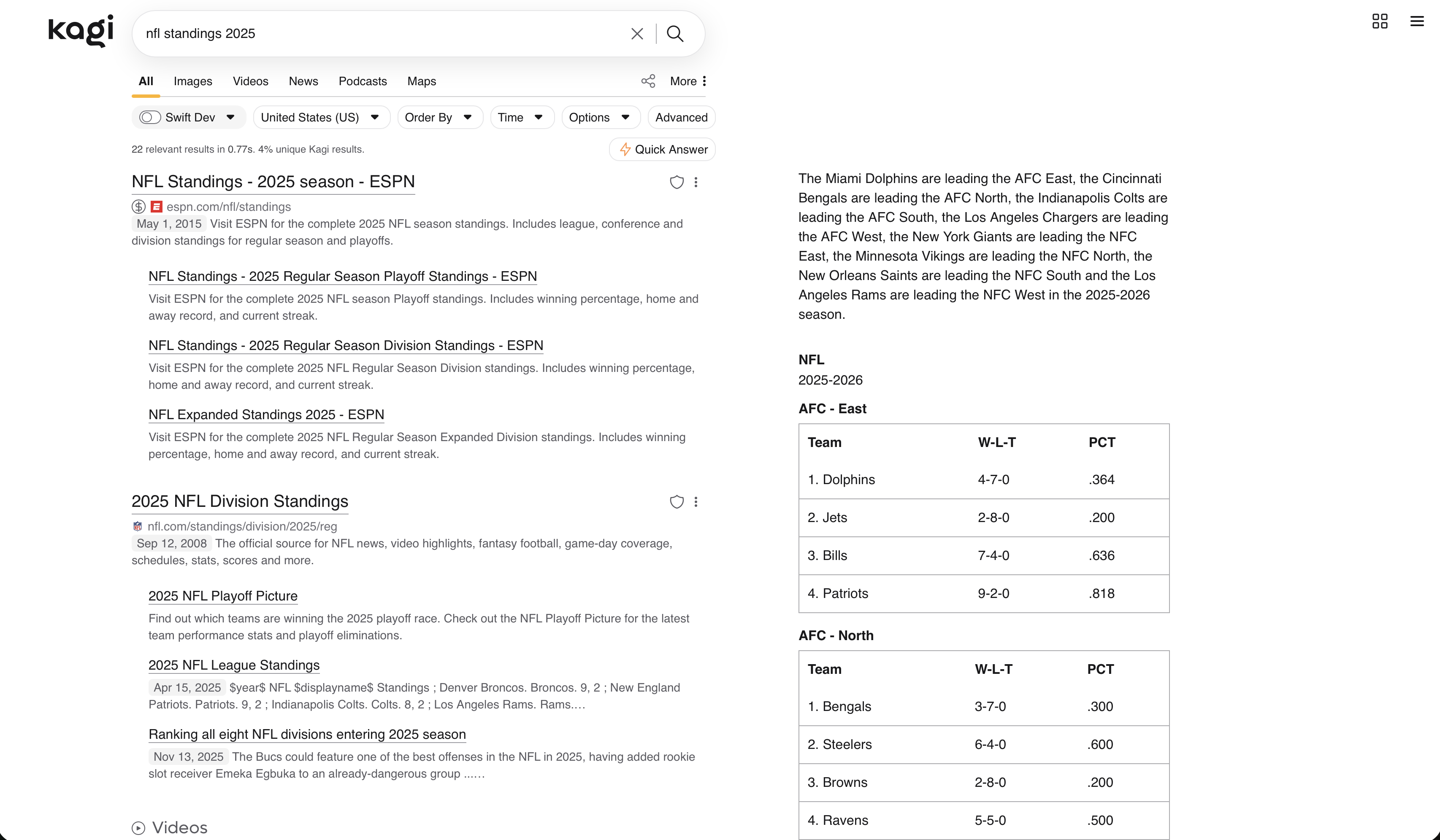
I think kagi's widgets are lacking and could definitely use a lot more love. That's the one thing I really miss from Google Search. Kagi doesn't have very many nice widgets. If Kagi doeos have widgets, they're very minimal and lackluster. I did a search for the NFL standings for this year and have a look at a comparison across Kagi, DuckDuckGo, Google, and Brave. Kagi is the worst one.
Kagi's NFL widget:
- table looks very basic (no styling, visually unappealing)
- lacks NFL logo and team logos
- lacks columns of helpful and useful information
Google's Widget:
- very visually appealing while being easy to read and make sense of everything
- great information without feeling overwhelming
- shows NFL logo and team logos
- can also switch to looking at the previous games and upcoming game schedule
- can click into each game and see scoring summary, top players, video recaps etc.
- can also view players
- shows home and away wins/losses
Brave and DDG's widget:
- nice visually appealing tables with good information
- can see previous games and upcoming game schedule
- can click into teams to view their games
- can click into each game and see game stats, team stats, etc. (Brave)
- can click into game and see scores for each quarter and next scheduled matchup with that team (DDG)
With Kagi, you can't do any of those things at all. This is a huge missed opportunity to make Kagi the best.


Get visual information at a glance. This is better than quick answer as you'd want a little more detail but in a visually appealing way. Widgets are also helpful for providing additional contextual information as well such as images, rich links, etc. Helps to surface the real nugget of information you're looking for quickly and in a visually appealing way with additional helpful information and media.
Side note: I think Quick Answers outght to go on the right side where you'd see widgets IMO. I think that would make sense.