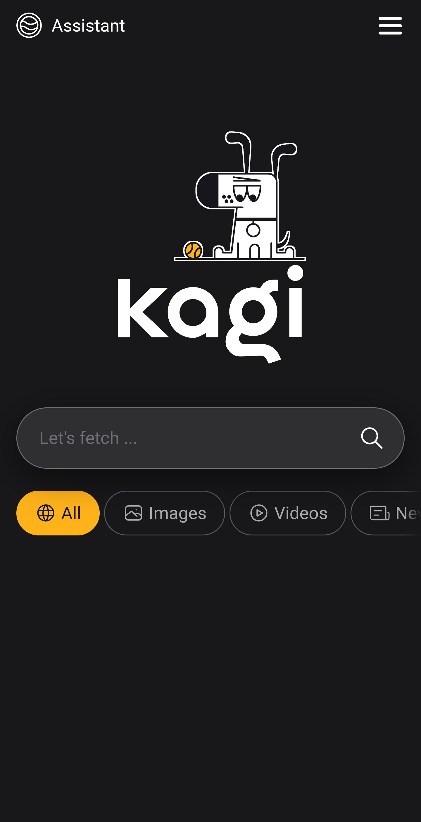
On Android (and presumably iOS), launching the "Kagi Search" app brings up a screen that looks like this:

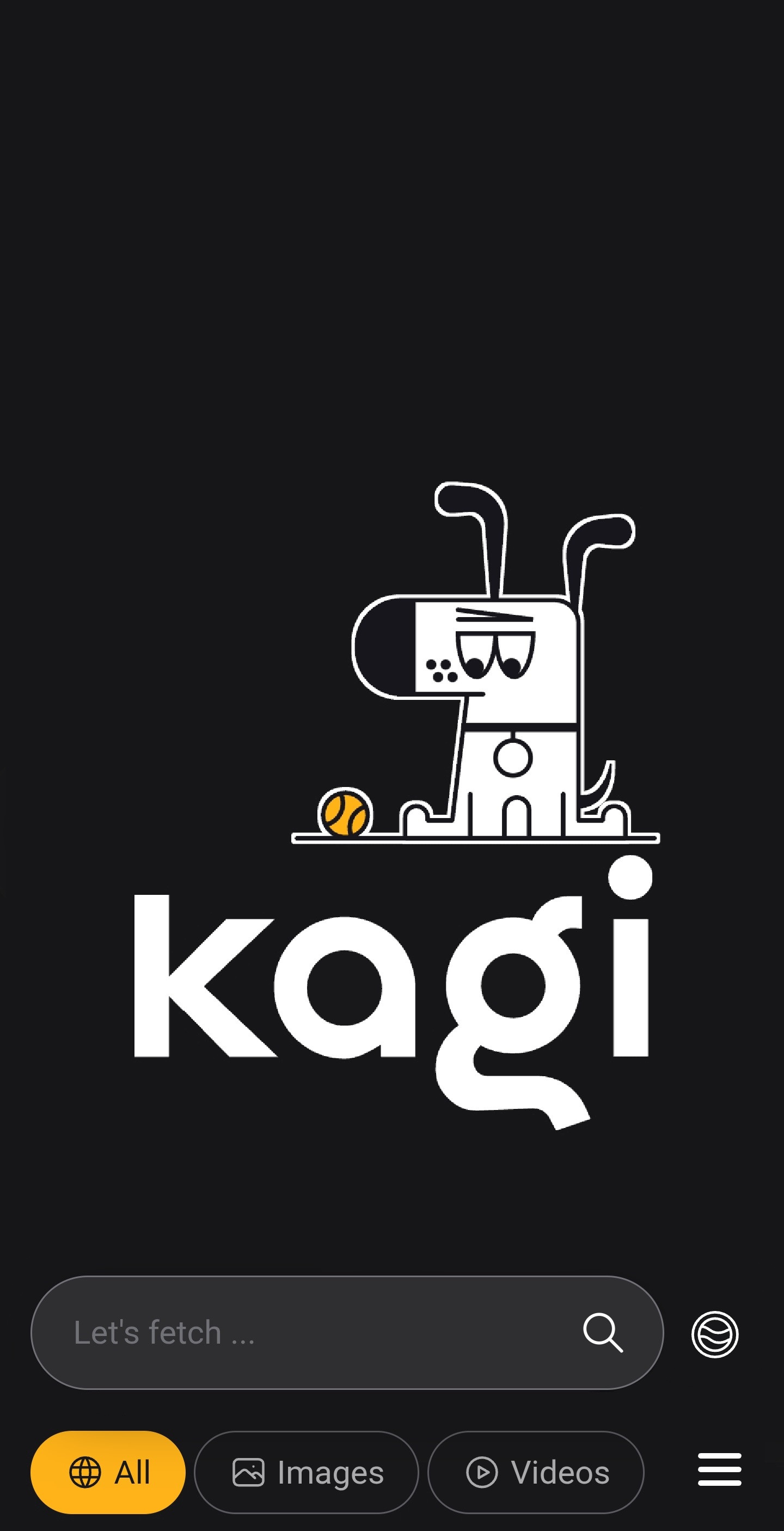
Many web browsers and similar apps have been moving certain UI elements like the search/address bar down to the bottom of the screen for easy one-handed access. I'd maybe suggest moving this down the screen as a default for everyone, along with the overflow and maybe the assistant icon. Something like this MS Paint masterpiece:

Additionally, an option to have the app launch with the search bar already focused (and this with their keyboard opened as well) would be much appreciated. I'd wager this matches what the average user ultimately wants to do a clear majority of the time.
This is a phone app, so the user benefits from UI elements being closer to the bottom of the screen for a clear majority of users (based on the normal way people hold their phones). Anything that aids in one-handed operation and anything that more-quickly gets the user where they want to go is always a plus, though I think the "autofocus the search bar" should probably be a setting that people can disable.
When I think of this functionality, one of the examples I think of are Android launchers like Nova & Lawnchair, which both have options to automatically focus the search bar upon opening the app drawer.