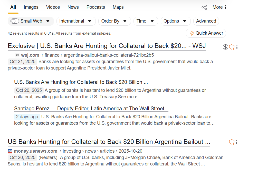
Kagi has an indicator for paywalls (currently on the left of the text) and for trackers (the shield icon on the right). Maybe I just don't pay attention, but I found it pretty hard to notice those.
I would find it a lot more consistent if both indicators were on their own section next to the result:

I would personally make them a bit larger as well, although that is up to preference.
This would have a few more advantages
- It would make it easier to visually scan the results for things you don't want
- There is usually a lot of empty space to the right of the results, so it wouldn't clutter the main result
- More importantly, I would hope that in the future there will be more types of content indicators for results (e.g. for advertisements, pop-ups, login-walls, AI generated content..) and having a column for them would let this happen more easily.