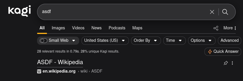
The Quick Answer icon when searching seems like it was recently changed to an orange lightning bolt. This is distracting as it is the only color icon in the UI, and there is no way to disable this button. I am someone who does not want to use Quick Assistant, and it feels like Kagi is really trying to drive my attention towards this button. I wish it were a white/black icon so it blended in better with the UI.
Separately, it would be great to an option where I could disable the button from appearing (allowing me to end my query with ? to get a quick answer if I opt-in to that feature).

Icon is a color only if it is important and needs to stand out. One example being orange shield icon for when a site has a lot of ads/trackers, which is useful for me to notice as a user so it influences my behavior to not click on that site.
Highlighting the Quick Answer button you want me to click is not an important reason, and for me, causes distraction in the UI as I do not intend to use that feature.