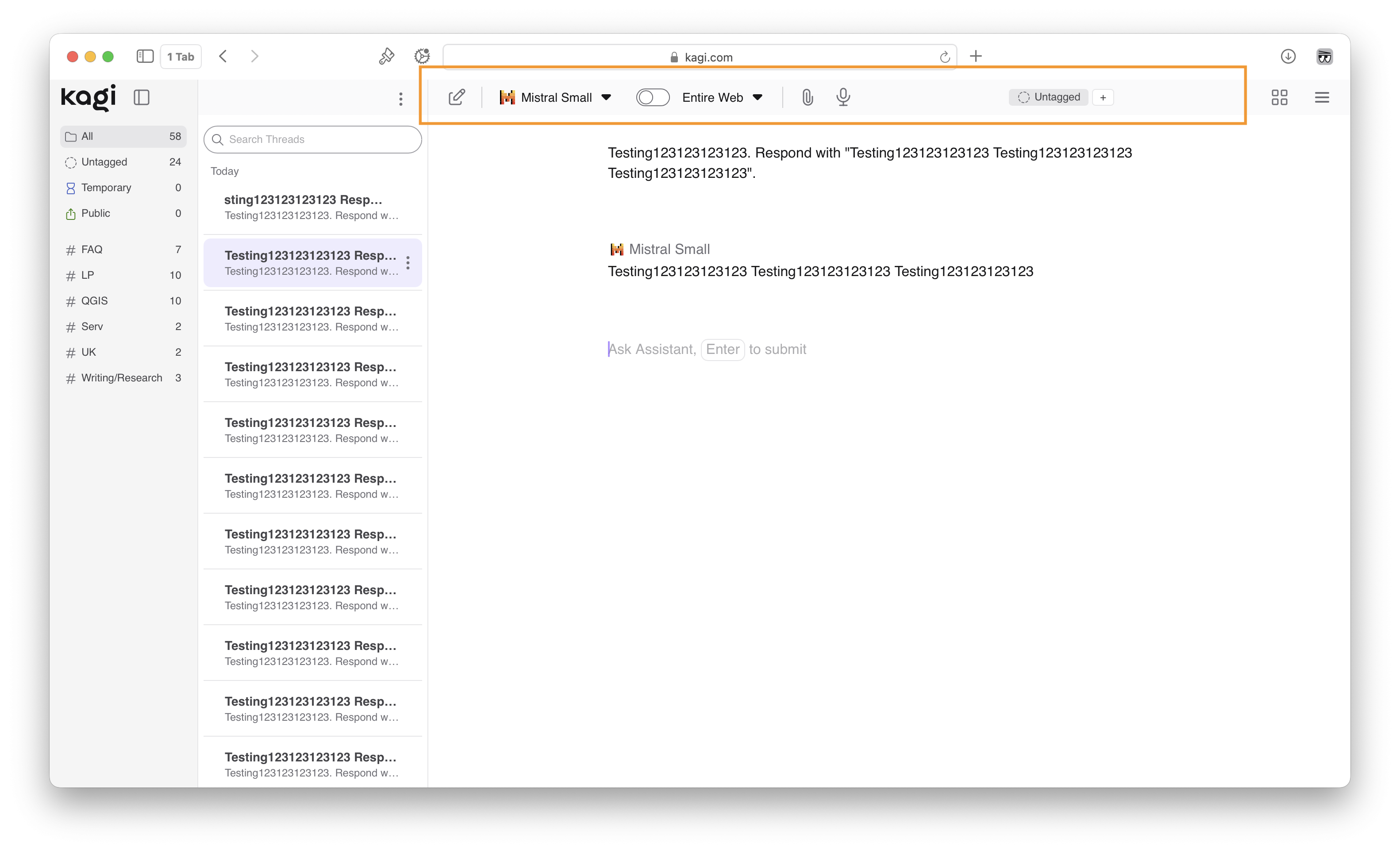
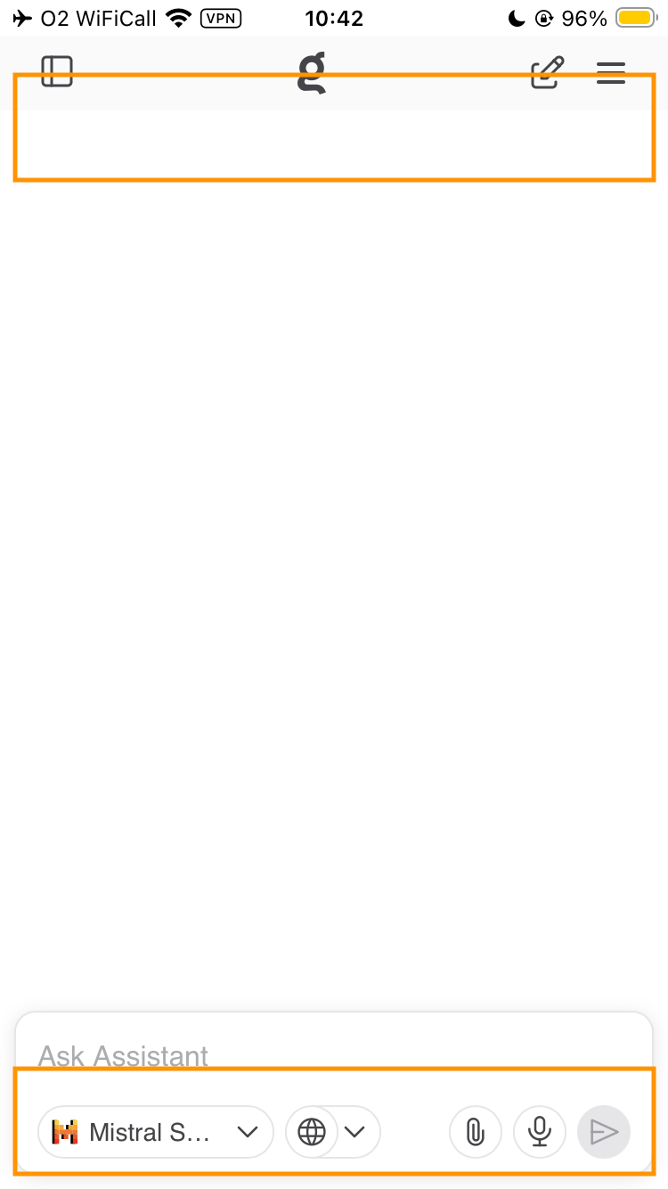
It may be beneficial to provide additional title headers for Assistant threads that allow for longer titles to be displayed easily, and for the name of the threads the user is currently operating in to be immediately clear. The current layout is suboptimal.
On desktop, I can see this fitting within or below the top bar.

On mobile, I can see this fitting at the top of the screen or below the existing chatbox.

Persistent thread headers can reduce mental fatigue by providing a clear visual anchor. This should definitely be an on/off toggle-able UI choice for users though, as some may find it to be visual clutter.