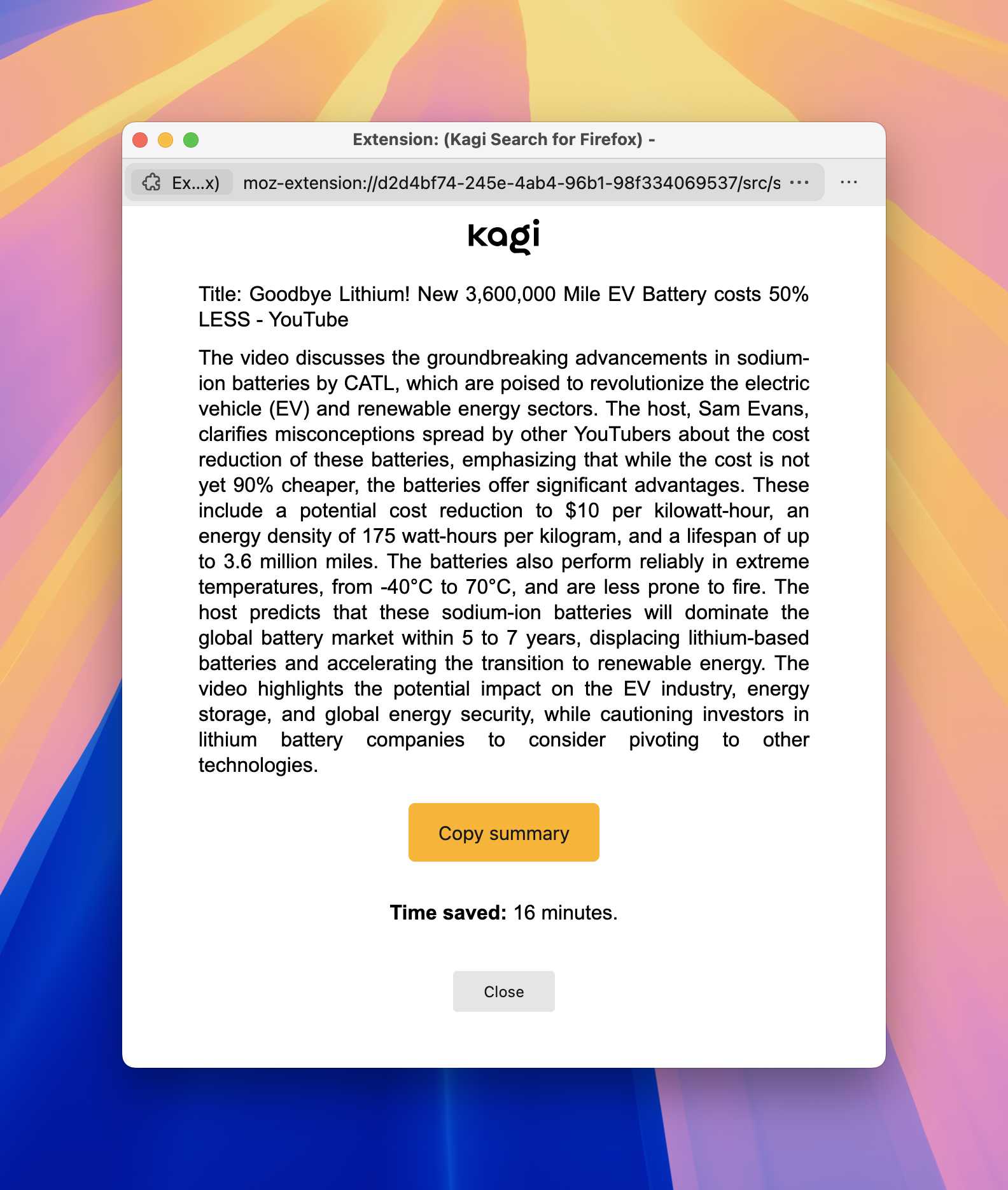
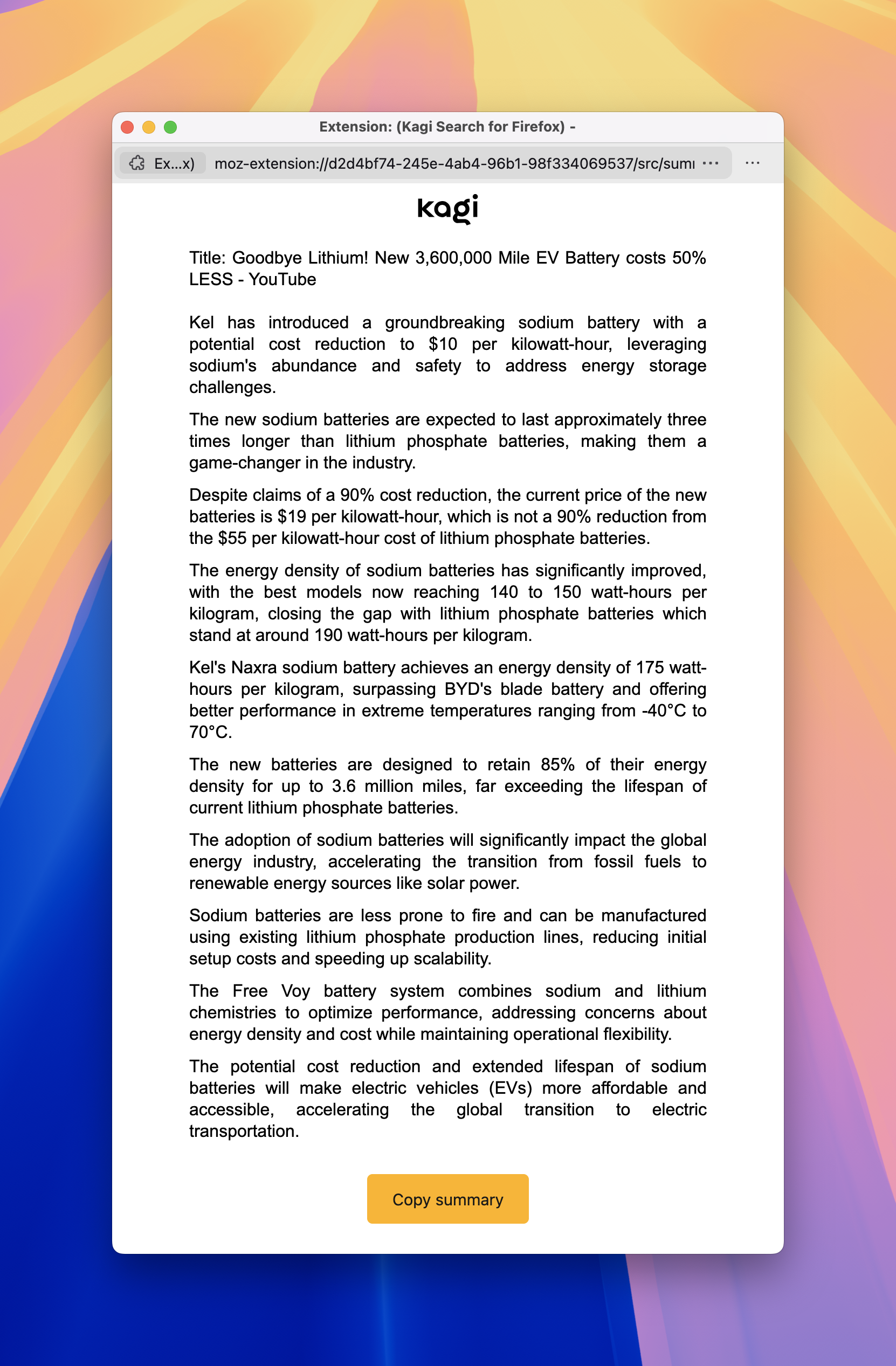
I really like the Kagi Summarizer feature in the Firefox extension. What I have a hard time with is the formatting — or rather the lack thereof — of the summary output text.

The issues:
- Everything scrambled into a single paragraph - makes it very hard to scan the text.
- Justified alignment of text causes uneven spacing and visual disruption (look up "rivers of white space")
Key moments version is better, but still suffers from the "justified text alignment" issue.

Please fix them both!
Here are W3C recommendations for visual representations of blocks of text: https://www.w3.org/TR/2008/REC-WCAG20-20081211/#visual-audio-contrast-visual-presentation
Here are the most relevant parts:
- Text is not justified (aligned to both the left and the right margins).
- Line spacing (leading) is at least space-and-a-half within paragraphs, and paragraph spacing is at least 1.5 times larger than the line spacing.