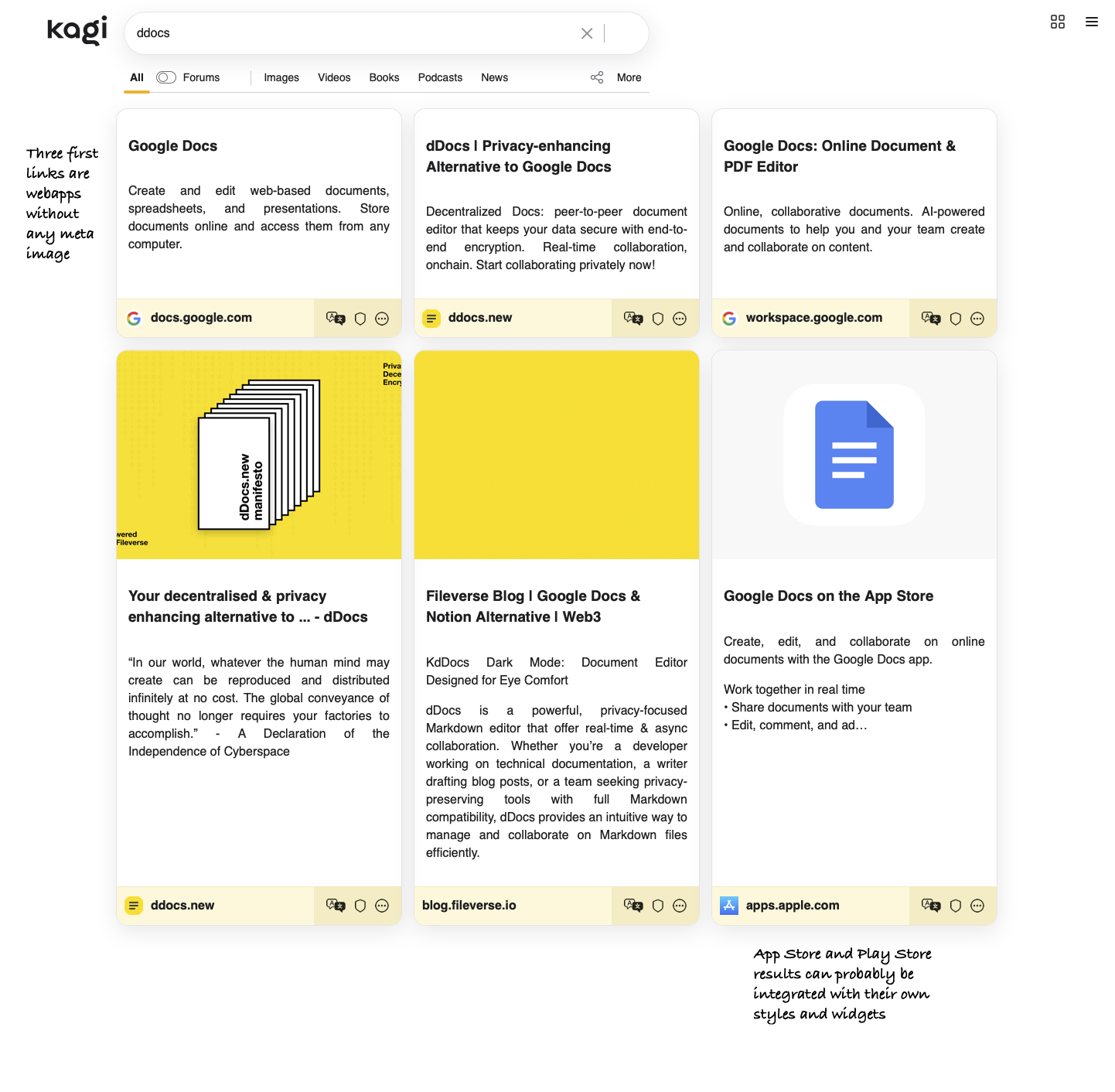
My suggestion is a "card" style interface for Kagi searches, which collects some info from each result through meta tags and by getting some paragraphs. This interface would make it easier for the user to judge the quality of the individual links, as well as help the user to get information quicker.
As this data retrieval is more computationally expensive for Kagi, the card view could be activated by a button after having made a search, so that the user is not inconvenienced by the loading time. This feature could also be a paid Kagi add-on.
Kagi already has a more immersive Wikipedia widget. I think these kind of embeds/integrations could be done with many more domains and media types.
Here follows a few images to illustrate the idea:

I like serif fonts, so here is the Gagarin query in serifs:
And here's a little video:
In the examples I have limited the results to 6, so that it's not too slow for Kagi to retrieve. There can be a button to load the next 6 or 9 results. It shouldn't be any problem for Kagis crawler to get the text, images and more from the results, using meta data and the readability script. For incompatible sites, just leave the search result description coming from your upstream search providers.
I have also made the three buttons on each result a little bit more prominent in my concept, but that's just a suggestion. Some other stylistic choices that you might not agree with: images on top of headliner text, unaligned paragraph depending on number of headliner rows, justified text.
As for mobile, the card idea becomes even more interesting, as you could swipe between cards if you want to. The layout is very familiar for mobile users.
Thanks for reading!