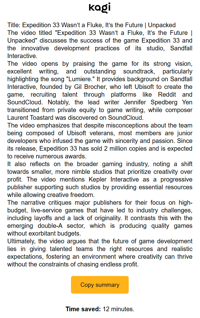
Not sure how to describe it exactly but I find the "summary" popup really claustrophobic and it makes it hard for me to focus and read it:

Maybe it has to do with the text being too black or too dense or there not being any real line breaks.
I am not designer and this isn't perfect either, but this to me seems "easier" to read. I'm not suggesting this as the final result - but it's a move in the right direction for readability imo:
