I'm very happy to see the development of an official Kagi App for iOS, but I'd like to see the app move in a more focused direction in terms of the UI design. Currently, it's a fairly mixed bag in terms of standardization of layout and design. There is a lack of a coherent focus on placement of elements and it does not follow layouts and design elements that iOS users would be more familiar with. The concept art that I have posted below would give users, in my opinion, an experience that they would be more familiar with.
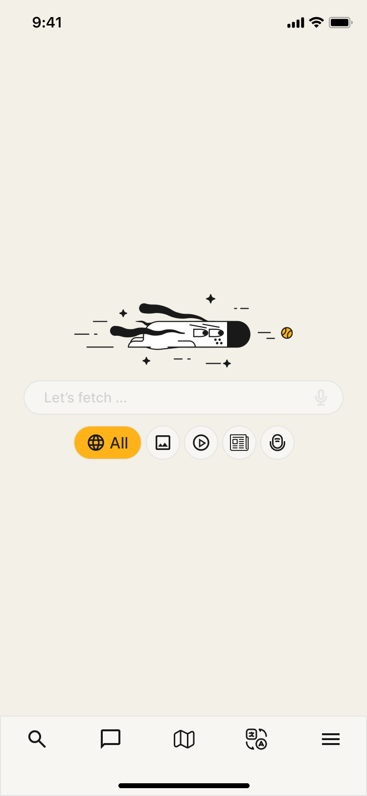
The main landing screen moves all elements to the footer to make access more uniform and easy to find and get to. The different search parameters buttons also have the text removed and would expand to show the text when tapped on. That way you don't have to swipe to the side to search for things like podcasts.
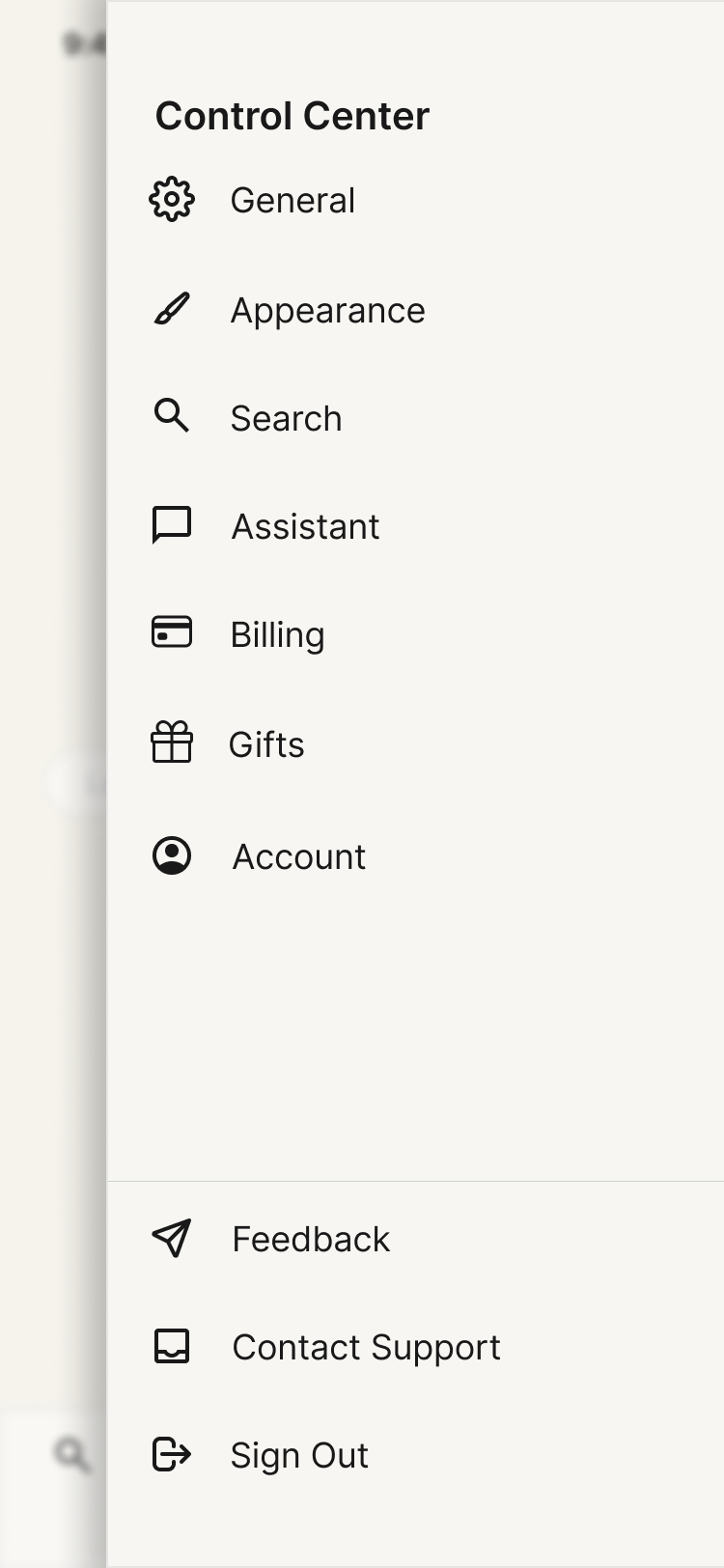
The control center design is more unified and less cluttered. There should be more sub menus to access specific settings related to each category. Additionally, there are also duplicate settings menu functions right now that need to be removed. The end result is a much cleaner, easier to use control center.
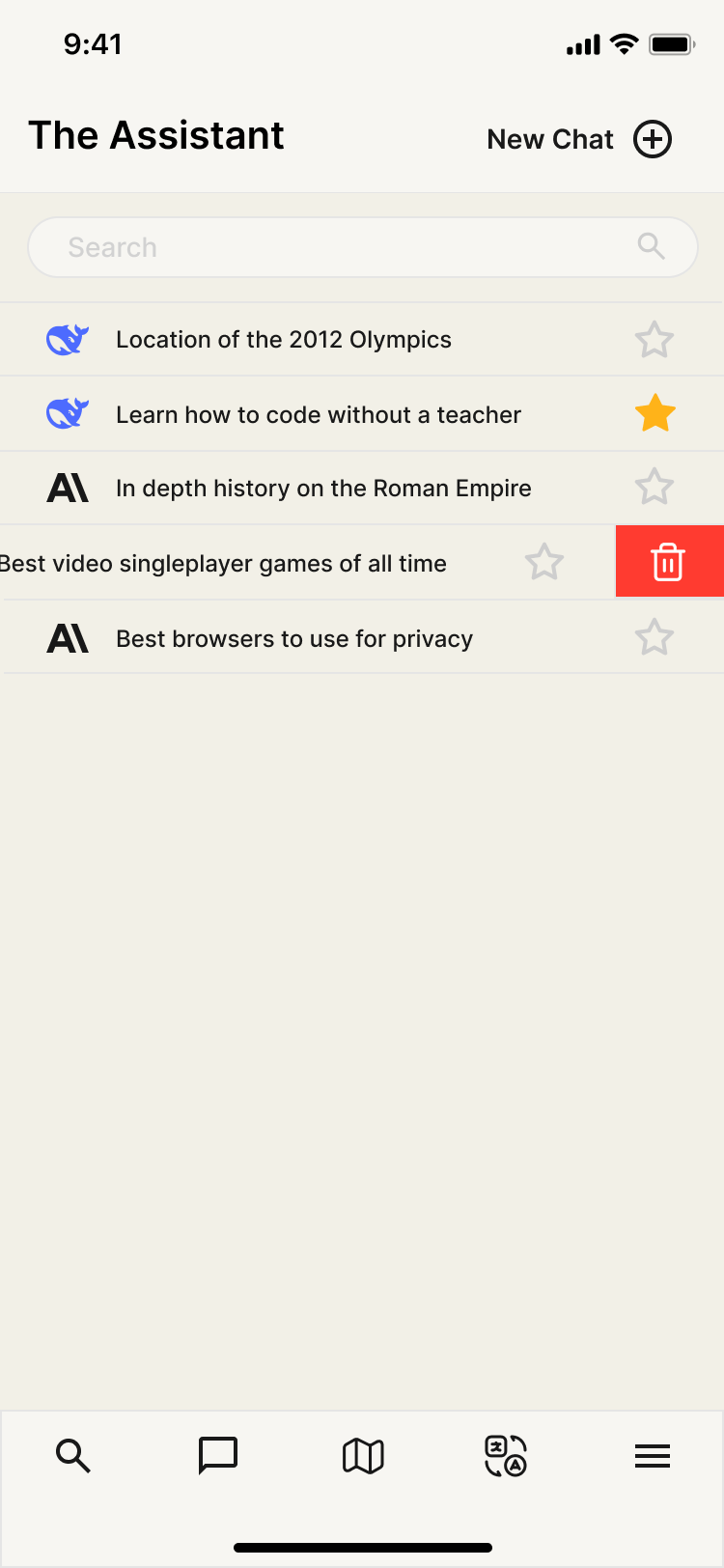
The landing page for The Assistant focuses on being a page to quickly access the previous threads/chats you've already created. It also focuses on using a swipe to delete function that is very common in iOS apps and reduces the number of actions required to delete old chats. Additionally, the UI is made more touch friendly by making elements larger and easier to see.
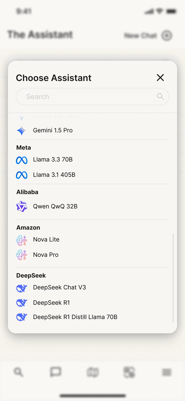
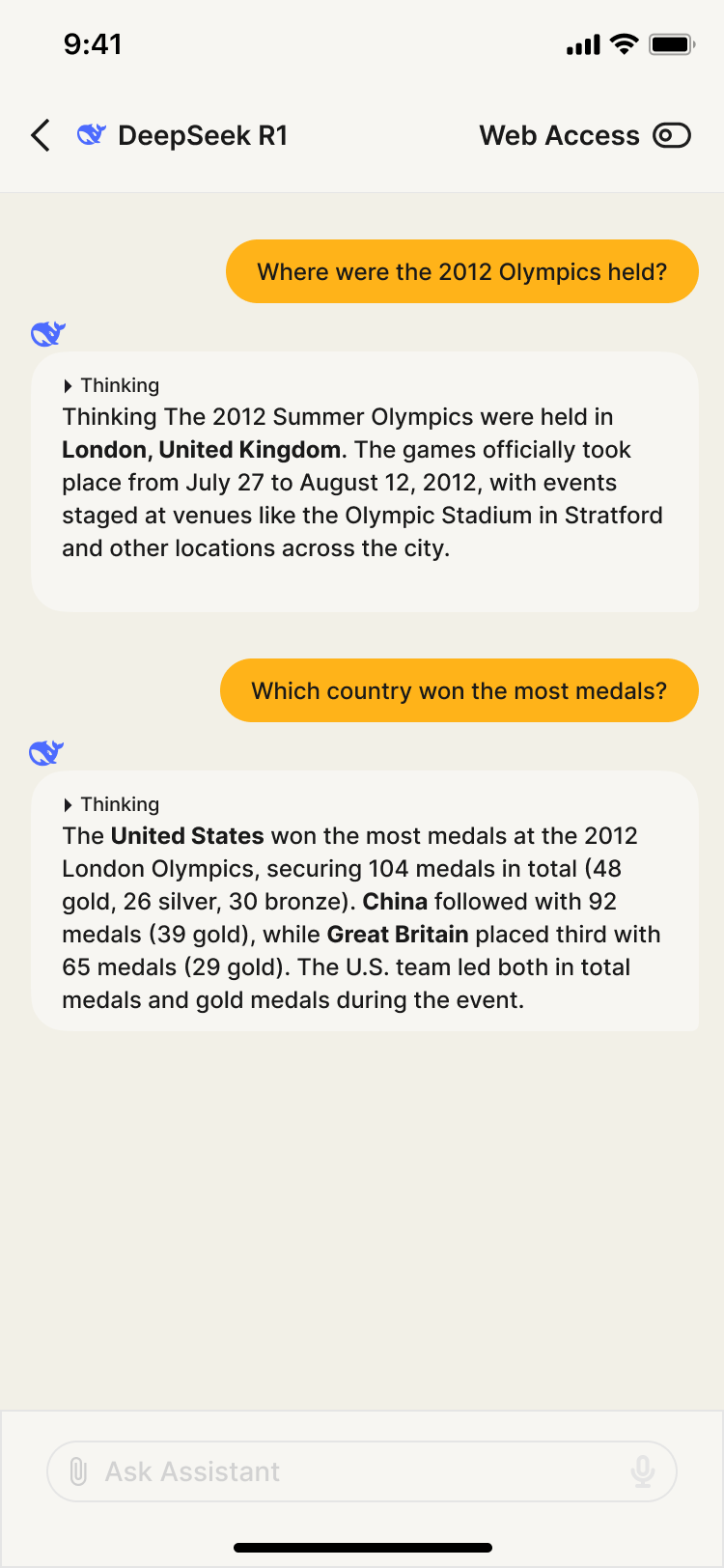
New chats and choosing your LLM is moved into the same window. This removes UI clutter that is currently present in the assistant chat windows. The UI is also made more touch friendly and visually pleasing to navigate.
The chat is then moved to it's own function. I've removed the ability to create a new chat or switch LLMs and this results in a more compartmentalized and easier to navigate app. The focus is on making things clean and easy to navigate while also creating a more uniformed style.
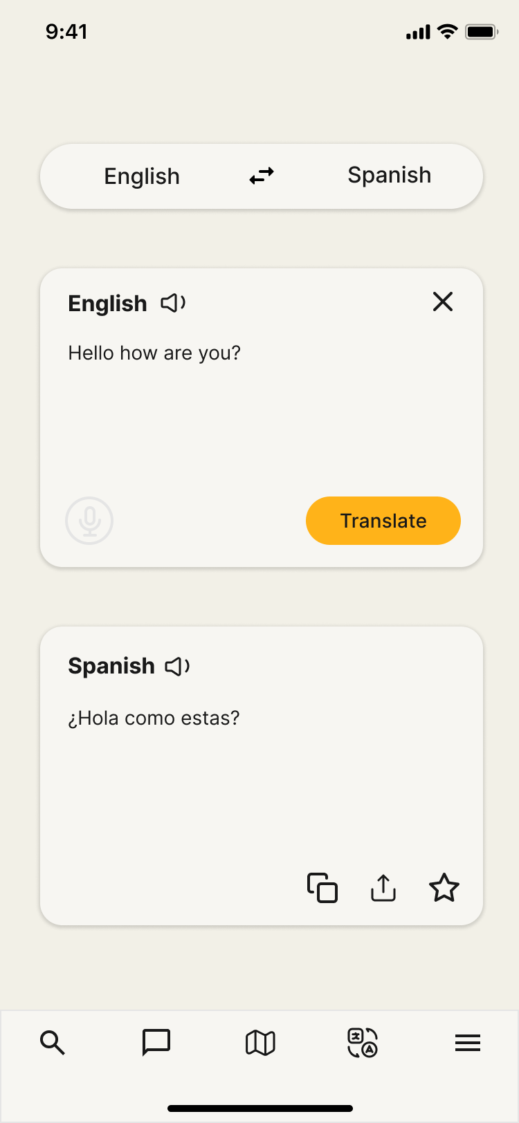
Finally, I wanted to highlight the translate section of the app. Currently, many elements are cut off or not designed to directly fit on screen. This update makes things easier to use and interact with as everything can be seen without needing to scroll. Additionally, keeping the unified footer at the bottom makes it easier to navigate from translate to things such as search or the assistant. Right now you have to tap on an unfamiliar icon and go back to the search if you want to access things like the settings menu.
Hopefully some of this feedback is valuable! I was mostly having fun imagining what a ground up design for the Kagi iOS app would look like, but I do think this concept art shows where improvements are needed. The end result will be a much easier to navigate and more user friendly app.