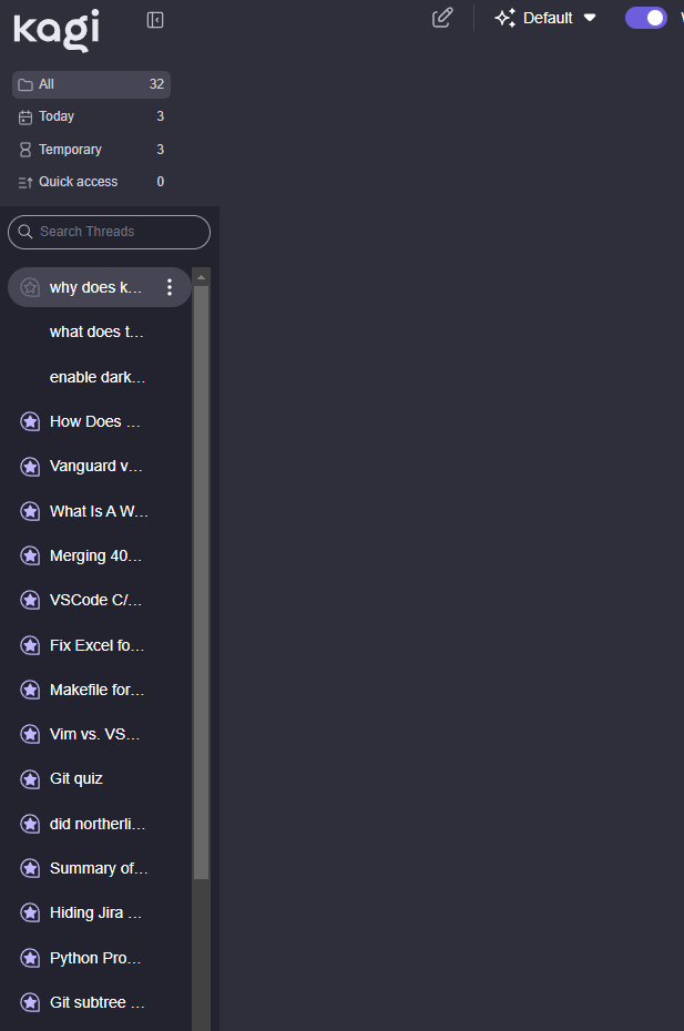
Yeah, just noticed this earlier too. Especially as the new left column contains hardly anything, vertically, but takes up that entire column on the screen, pushing all of the thread names into a uselessly small space.
Why were the new categories not just added at the top of the threads list, instead of pointlessly taking up a bunch of horizontal space? I really don't understand why it wasn't just done like this (without also narrowing the sidebar) instead?
(Clumsy edit of Primer81's screenshot)

But instead, we have:
