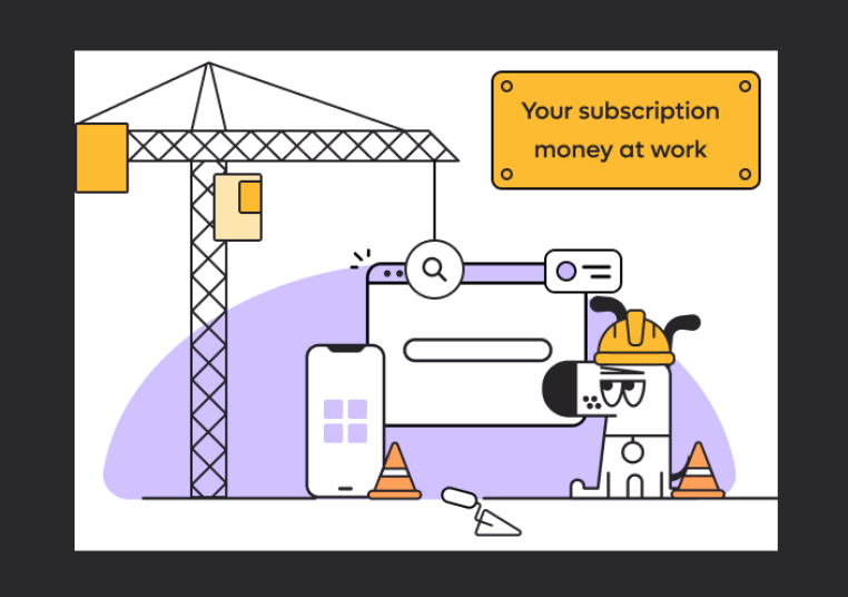
The changelog page has a little "Your money at work" illustration featuring a Doggo doing construction work. The illustration has a white background, which works fine for light mode users, but in dark mode the edges of the image are clear and honestly don't look great:

This is a really cute illustration that also gives users a good sense of Kagi's business model imo, so it would be nice if it looked as best as it can. Either a dark mode version of the image should be created, or the edges of it should be extended and the corners rounded off, maybe with a small drop shadow? to better incorporate the light image into the dark theme.