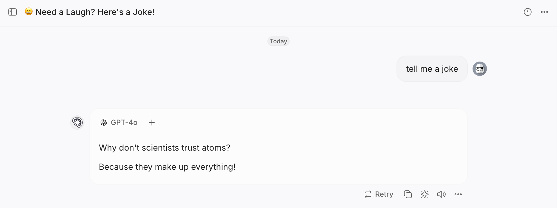
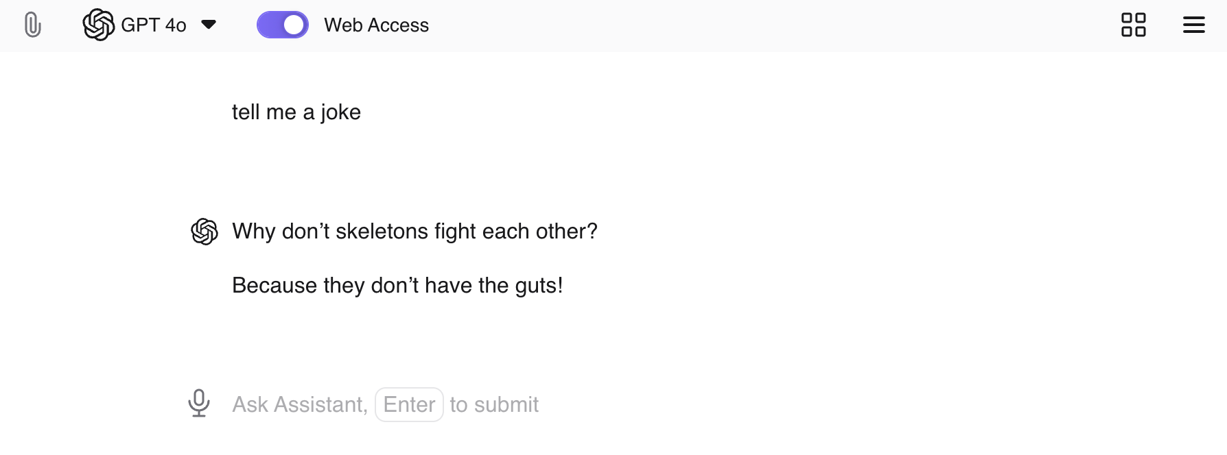
The default style/alignment of assistant is not really optimized to distinguish request and responses. Alignment and also usage or color variation could help to improve this.
That could be set as default or proposed as settings (of course styling can be customized with CSS, but I admit this is not an advanced customization).
Sample of alternative Chat (Thinkbuddy):

Kagi assistant:

The aim is to improve the immediate readability of the various threads.
The change could be made by default, but depending on preferences, a simple addition of options for display preferences would resolve this issue (alignment, color, etc...).