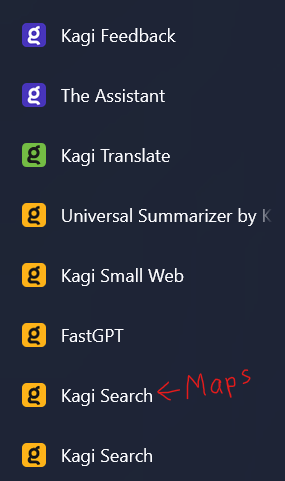
The current logo for the different Kagi products is just the "g" from the Kagi logo with different background colours. This can be hard for people who doesn't know what colour is for each product.
It may be weird at first, but I think this will be much easier for people to recognize which logo means what, instead of memorizing the colour for each Kagi product.
I'm not sure if this may also impact colourblindness, but if that is the case, that is another argument for making new logos.
Many products even have the same colour. Translate is green. Feedback and assistant is purple. Everything else has the yellow background.

With new logos, you should easily be able to distinguish the different products without having to memorize the colours. If you take Google Translate as an example, you can easily distinguish the icon from other Google icons. I would like Kagi to do something similar.