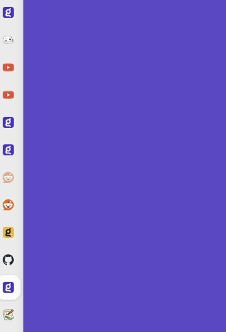
Since there are quite a lot of different features Kagi offers now, it's hard to immediately recognize them when they're in, let's say, a sidebar where there's no text but only favicons.

I know colors are different, but it's still not easy to immediately differentiate imo (Kagi feedback and assistant even share the same favicon 😕).
It would be nice if we could differentiate each service via favicon more easily than we can now, like Google, where there are different logos used as favicons for each product.