I'm happy that search is usable in general in text mode. I have some thought on what can be improved, and I was asked to provide my feedback on discord.
Logging in
JS-less login if possible. As elinks spits out 403 with plain old form submit. I guess some headers are missing? Not a blocker - can be worked around with session link.
SERP


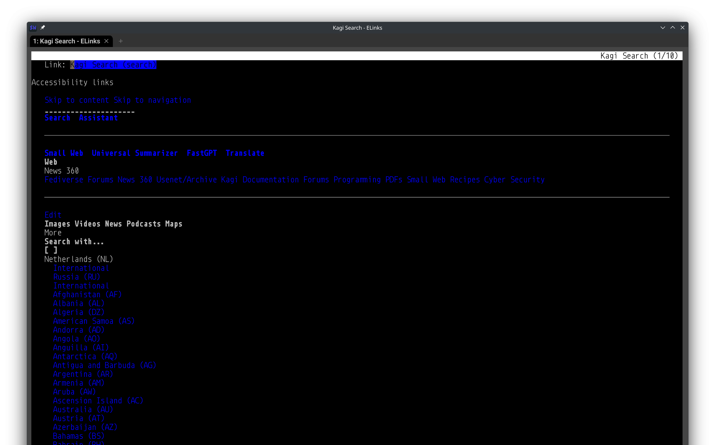
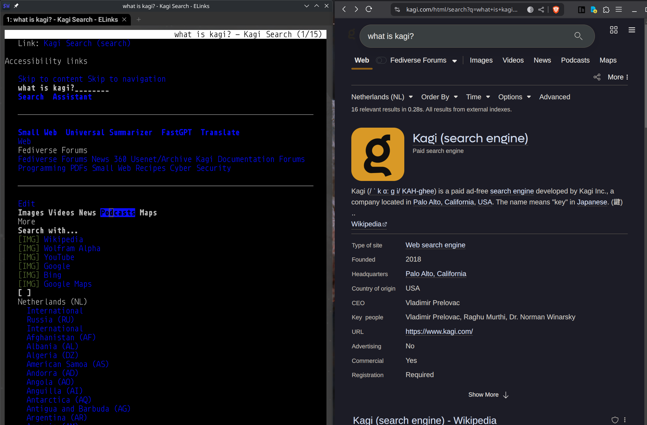
As you can see on the screenshot, we have several UX problems:
Search field,
- though visible and accessible, lack proper label, and at first is a bit confusing, since its surrounded by several buttons, and its not immediate to see what its for if its your first time.
- Separate text elements have weird spacing, making it hard to read. See Skip to... section on top
Navbar
- Content 'lenses' are split into multiline sections, consuming to much space
- Fediverse forums selector takes a lot of space
- In general, I feel that lenses should be at the bottom of the page, behind another 'Skip to...' link
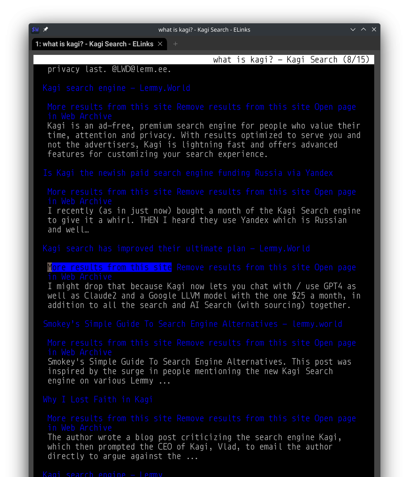
Result content

- If you scroll for the search content... Its curious that I have such a difference in SERP results between two browsers in a single login, for same search query...but that aside. I think its good and usable, coupe of nitpicks: Favicon of X - bears no meaning in text. I dont see site domain chip - its essential for me to visually scan for sources.
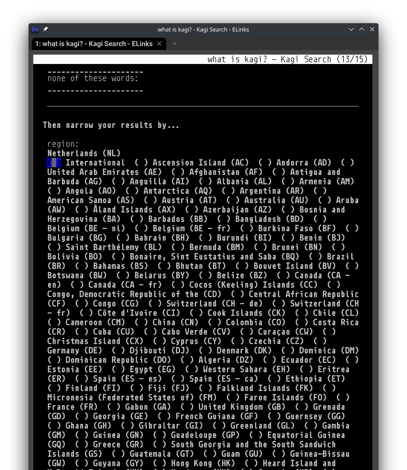
Advanced search:

- region selector takes a ton of space (I think the problem with selectors is that they are not semantically correct - ULs instead of select, and semantics is super sensitive thing for text-based bros)
- Section grouping, labels and word spacing is making the whole pane a mess
- Cancel button in the bottom of Advanced bears no meaning in text mode
Thanks for all good work!
read above