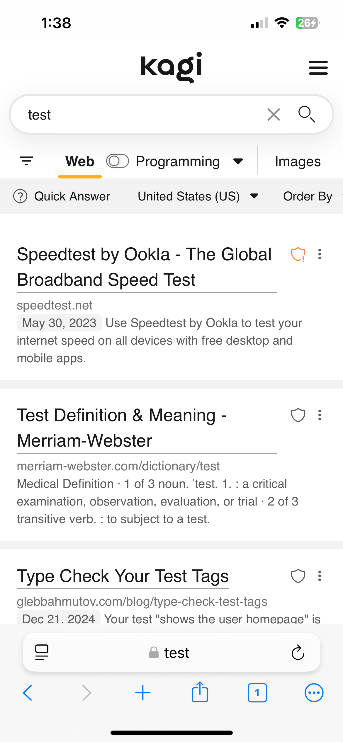
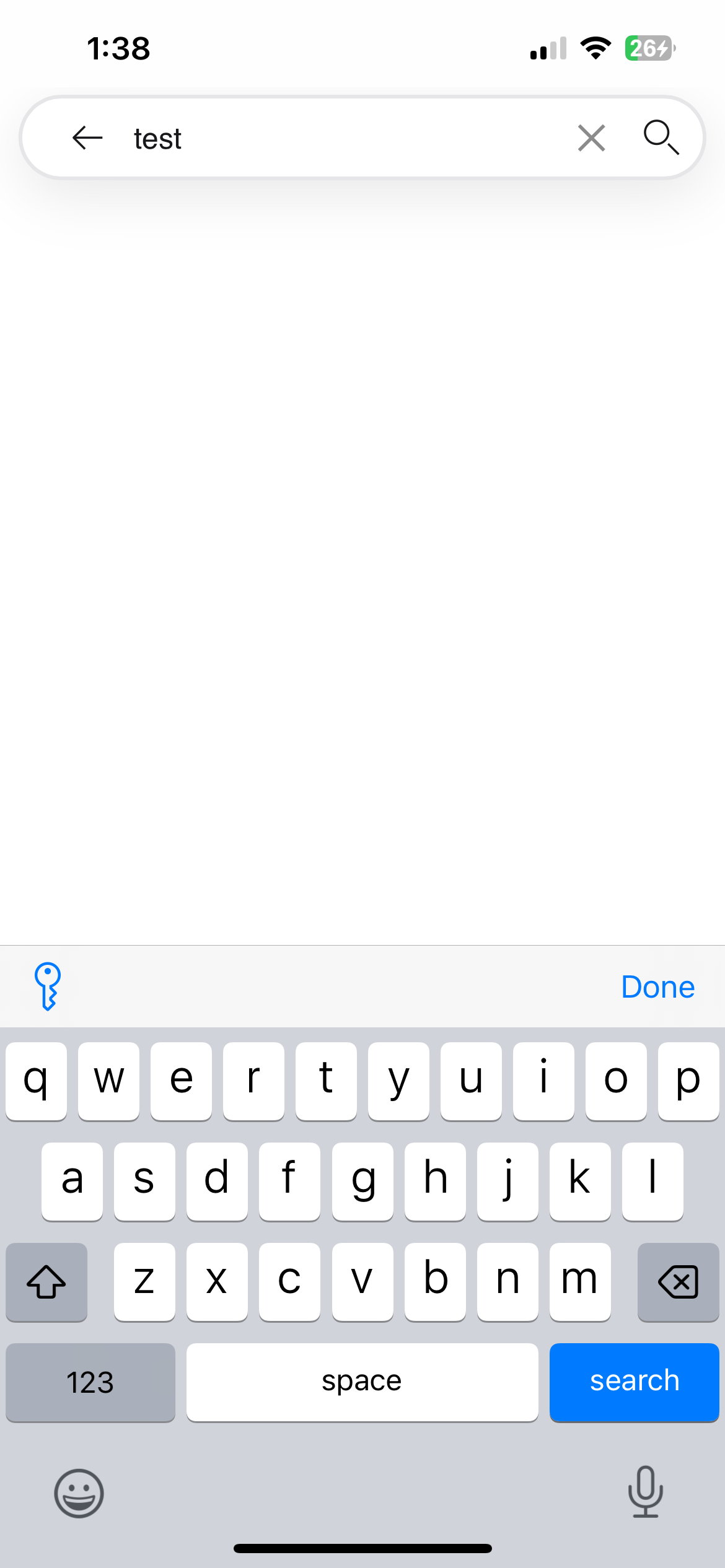
Some time ago the query editing experience on mobile was redesigned, positioning the input box at the very top of the screen, presumably to fit more suggestions on-screen.
However the query input box on the results page is at a lower position below the Kagi logo, shifting to become the editing page on the initial tap on the input box. As a result the input box appears to move vertically on the first tap.
Search results page, notice the position of the input box

Query editing page, notice the position of the input box

On operating systems where double tap is a text selection gesture (iOS) this leads to a less ideal experience when a user double taps on a word in the input box on the results page to select it for editing. The first tap moves the input box and in best case the second tap does nothing but in the worst case it selects a pre-populated suggestion causing a navigation to a new results page, loosing the original query in the process.
There are ways around this behavior, such as intentionally tapping first to move the input box, navigating back in history when a suggestion is accidentally pressed, or depending on the browser opting to use the navigation bar to edit the search query instead. However this is still a less than optimal experience in my opinion and impedes a basic system gesture.
Device: iPhone 13
OS: iOS 18.3 (Developer Beta)
Browser: Orion 1.2.14 (9) (WebKit 8620.2.2)
Kagi "Mobile search bar" setting: Top
Desired Behavior: For the query input box to not shift after the initial tap, allowing for iOS double tap from the results page to successfully select the double tapped word.
Thanks for your time!