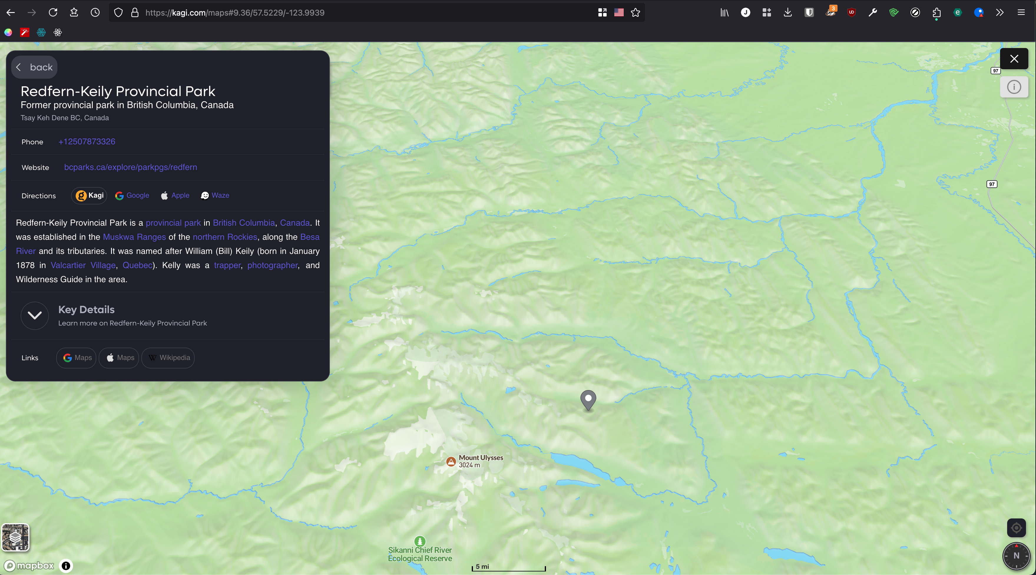
Maybe I'm missing how to do this, but I'd like the overlay on the Maps to be significantly smaller than what I am seeing right now:

It takes up likely a quarter of the map area which is really driving me nuts. To be able to collapse that to just the POI name would be really nice.
I would like as much of the window to be used for the map as possible. Any information on the POI beyond the name is nice to have, but ideally can be revealed if needed, and by default collapsed/hidden.
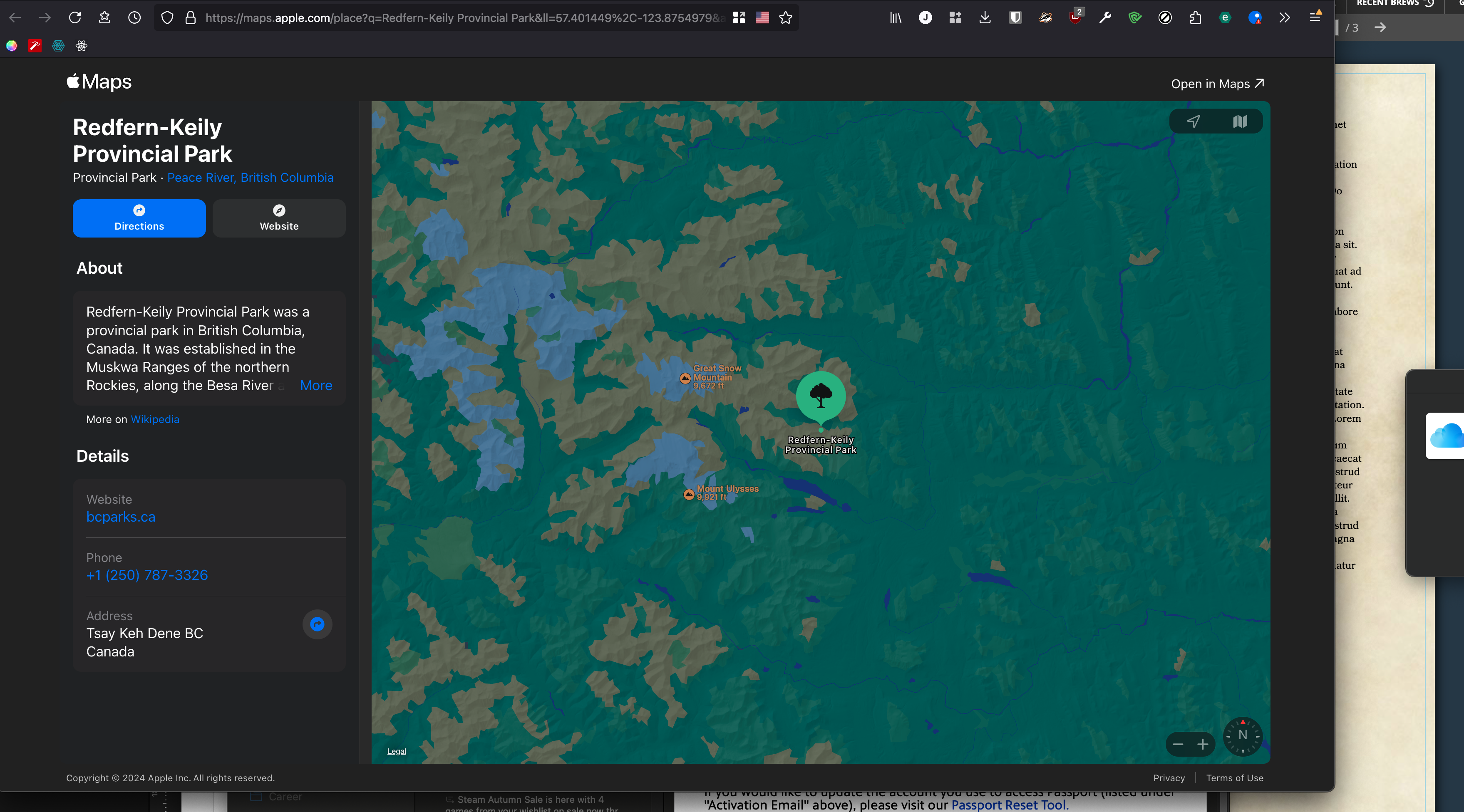
But oddly enough, when I go to look at how it's done on the new-ish Apple Maps (on web), somehow their UI both takes more space than Kagi maps yet I don't really mind it as much:

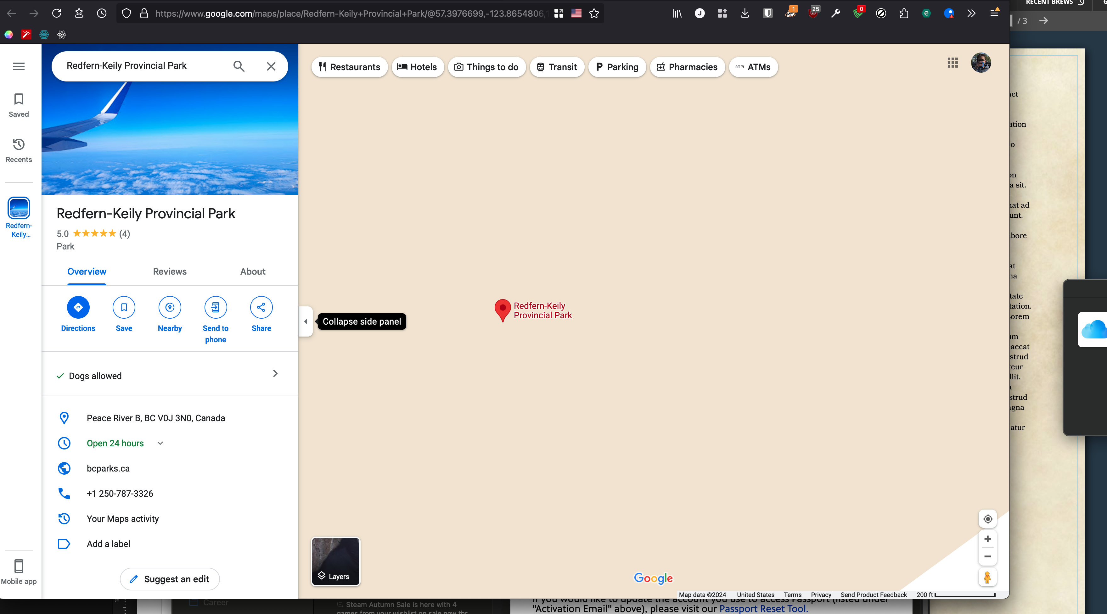
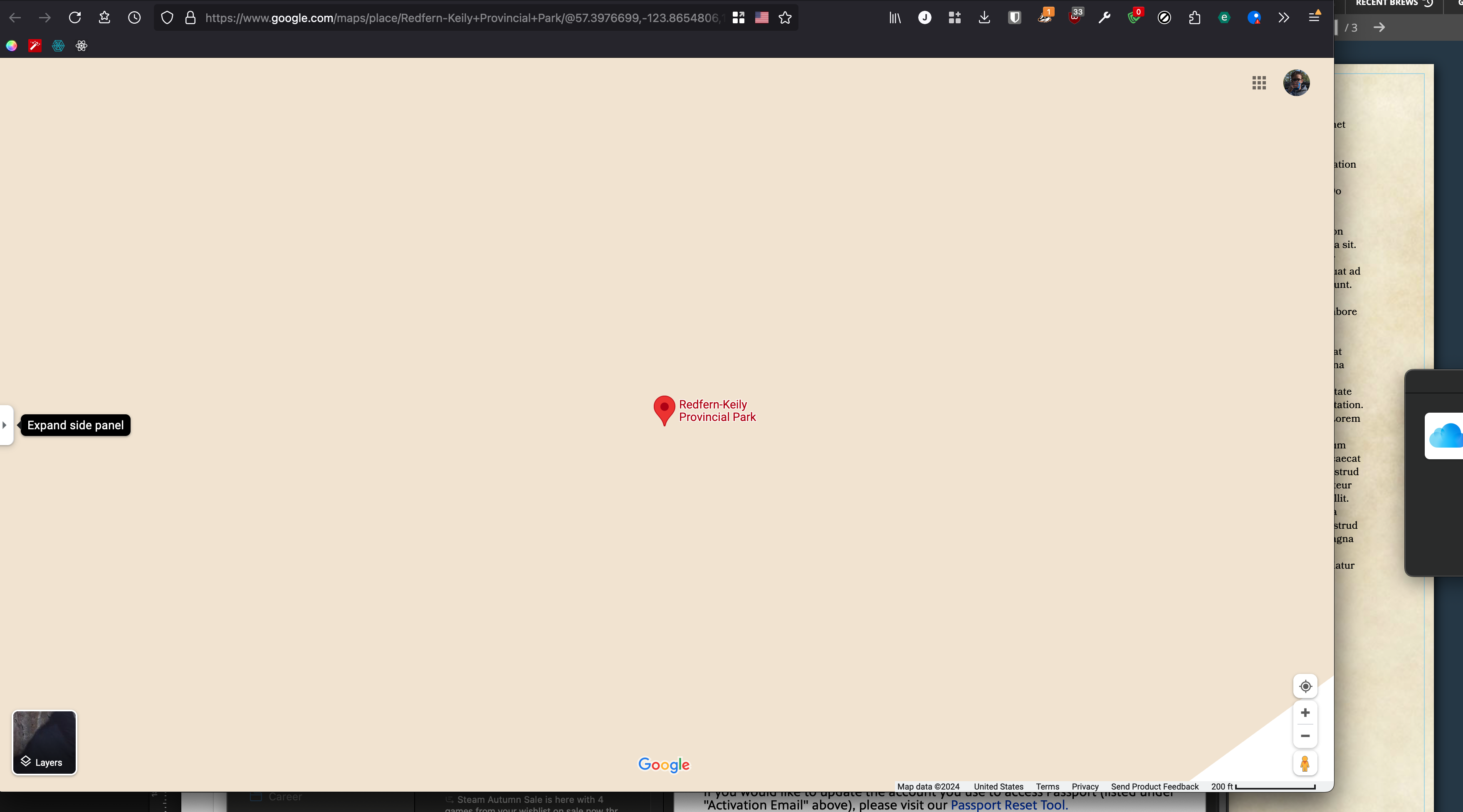
Maybe because it doesn't feel like it's obstructing the map. It's a whole side panel. Similarly, Google Maps uses a panel, but best of all it allows the entire panel to be collapsed:

