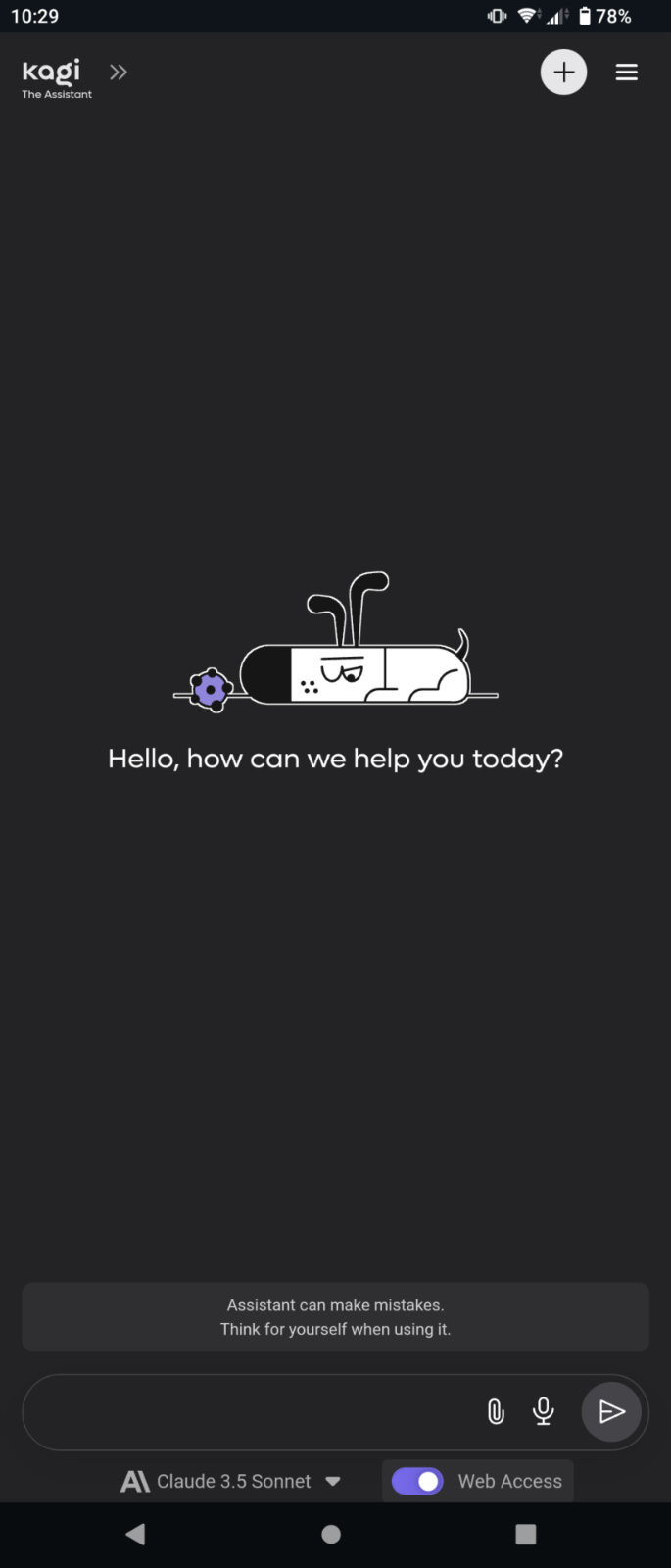
Not quite a bug so I'm leaving this as a suggestion. At least on my phone, on the Android app, the Assistant page leaves all the controls at the bottom in a small space that makes it hard to accurately tap what you want. This is probably also an accessibility issue, I know my father would find it unusable.

Would be nice to see the tap targets spaced out more, particularly the padding to the native Android navigation bar.