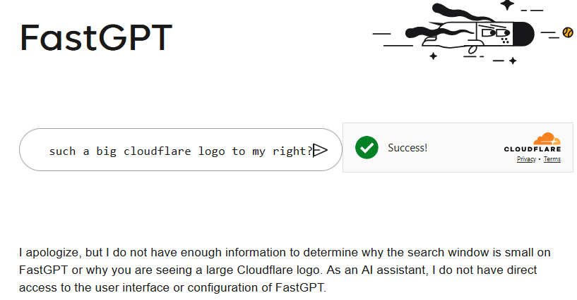
Why is this search window so small on FastGPT and I see such a big Cloudflare logo on the right?
The line where you type is really short.
To understand what I mean, please take a look at the attached screenshot.
FastGPT with hughe cloudflare logo.png
to have a wider line where to type. I think normally the cloudflare logo is below.