I've made a mockup of how Kagi could redefine the way people interact with a search engine and finding information online. Inspired by the excellent NetNewsWire GUI, I think this way could be a better way for people to find what they're looking for and use the powerful Kagi tools. The mockup is made with neutral/system colors and glyphs.
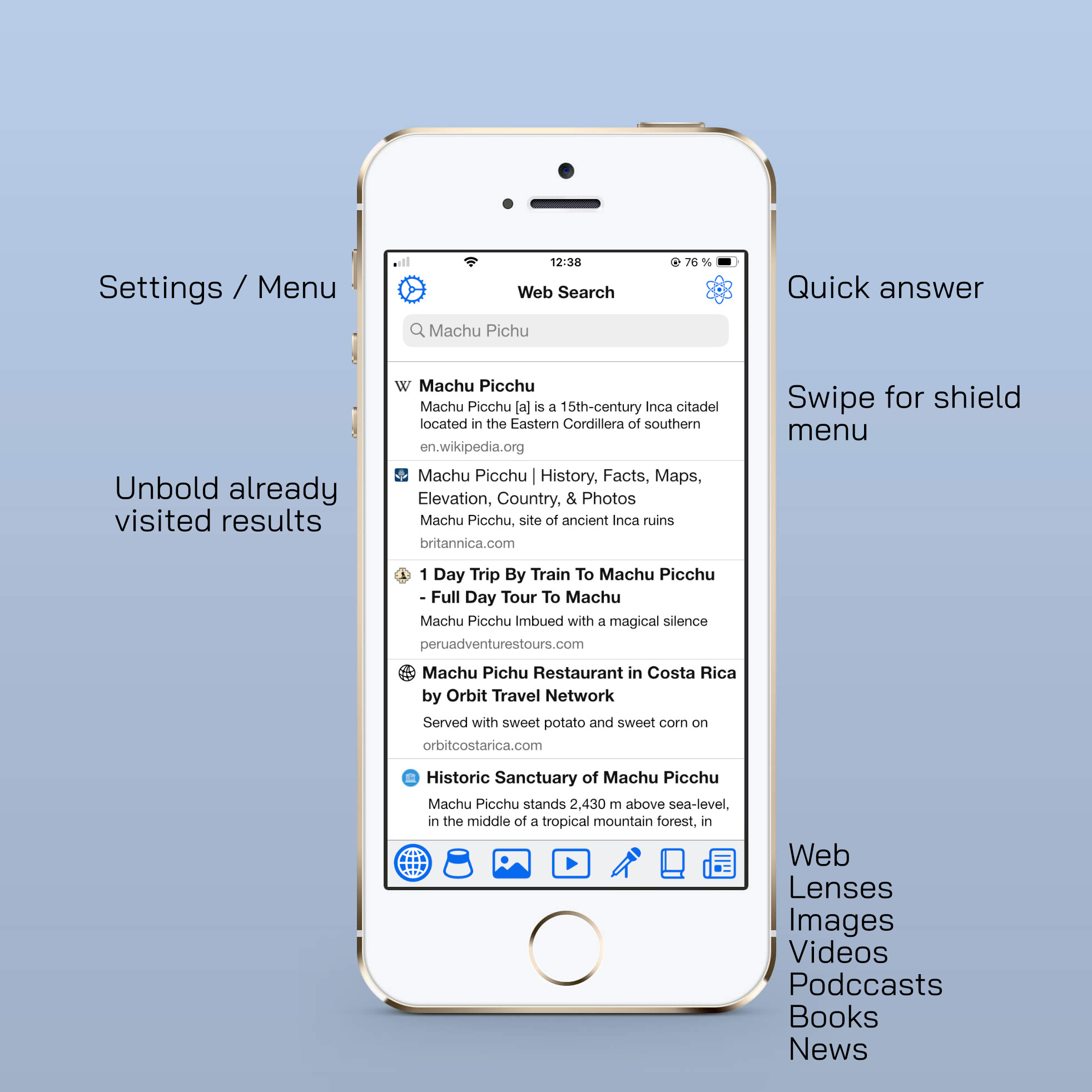
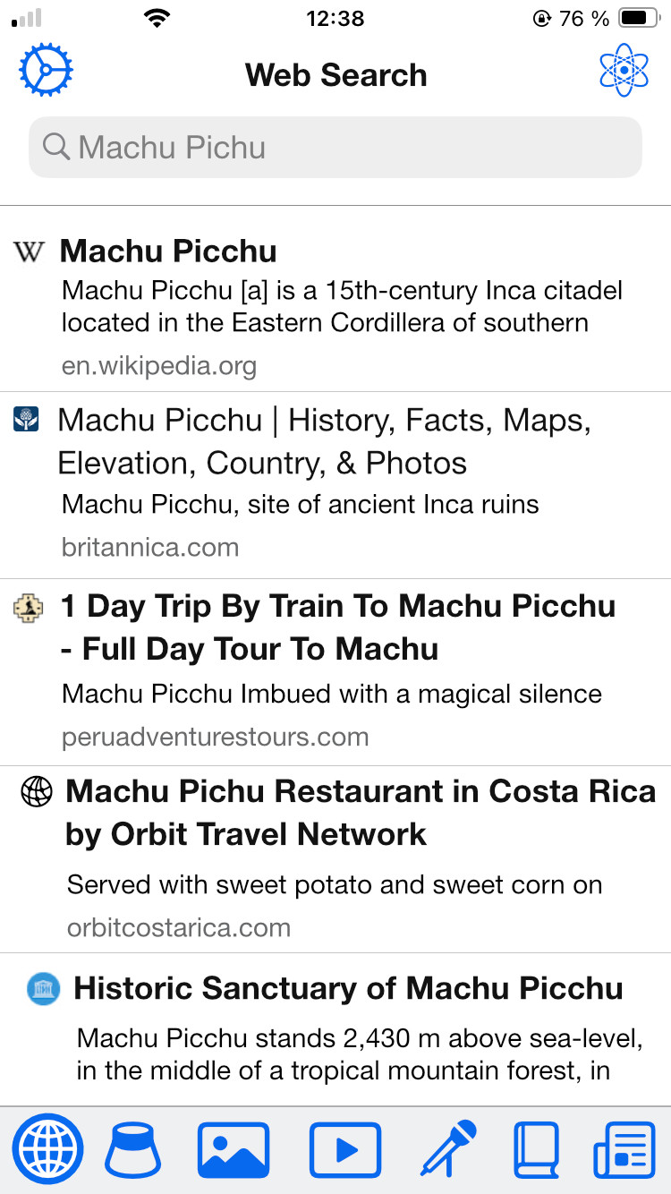
This is how results would be presented, after the user has made her search:


Results are presented in the same way as e-mails or RSS feed items, which I think is better. The user should be allowed to customize how many rows of title and how many rows of paragraph text for the results. Already visited links are unbold. Black and blue for unvisited/visited could also be used. The advanced search filters could be a button next to the Quick Answer button on top. I haven't included them on this mockup.
On the bottom bar you have the different search "tabs". I have added Books, because you can always dream, and I have removed Maps because Kagi Maps doesn't yet live up to the general quality level of Kagi. Besides, everybody with an iPhone has Apple or Google Maps.
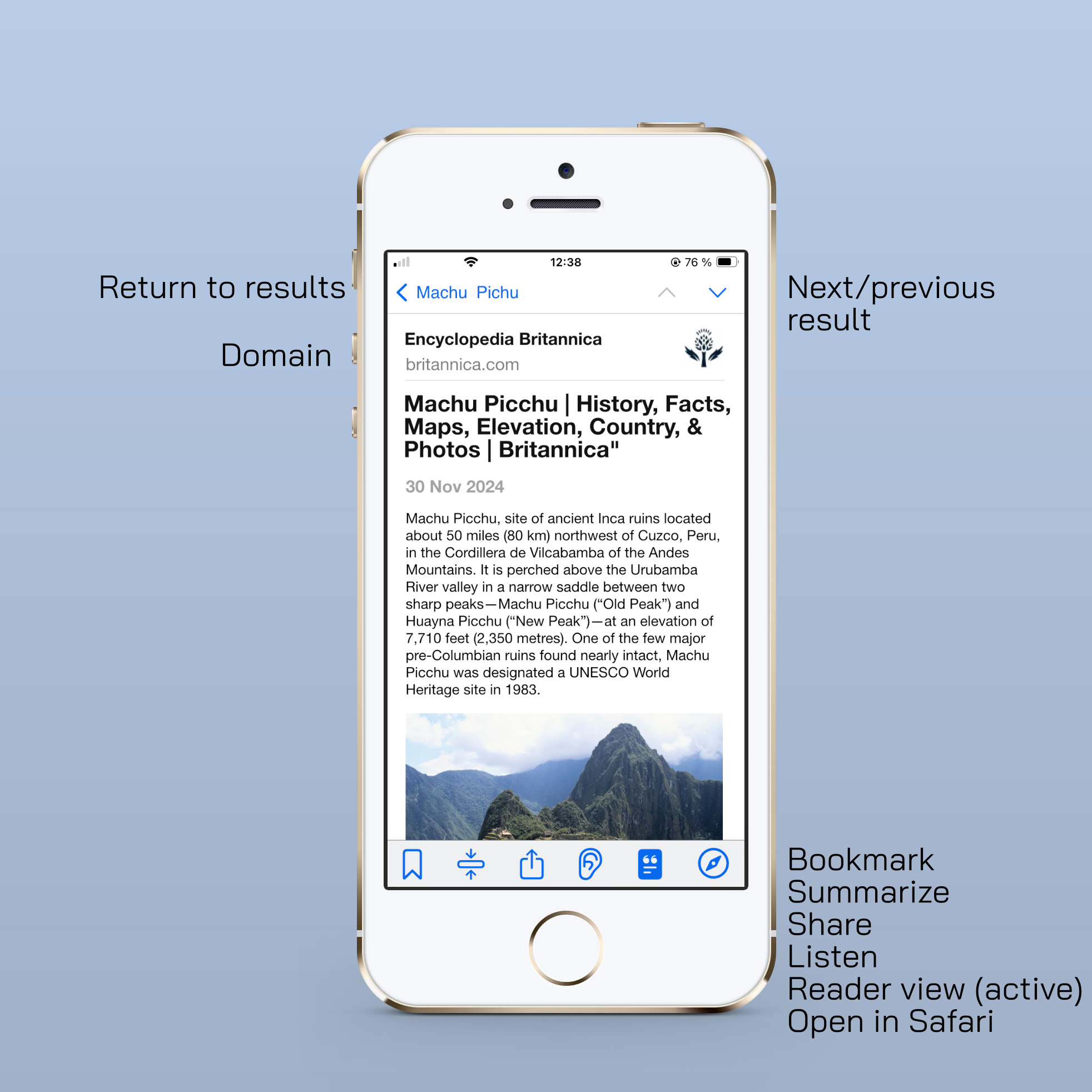
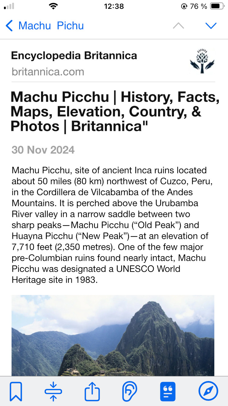
The second mockup shows how a search result is displayed after the user has opened it:


This user has set her preference to always open results in reader view, as seen on the activated icon on the bottom bar. Back button takes you back to the search results. If you want to go to the next/previous result, you can also use the arrows on top.
I think users should be able a simple bookmark function for a result they like and want to go back to later. This could also be a star. Should summarizer be something that you toggle on until you toggle it off, or should the user have to press it on every result? The "Listen" icon would do just that, start reading the current search result so that a person could listen to it. If you want to make it really special, you could automatically make chapters out of any web page by using the headings (h1,h2). Then a person could listen to an article or a how-to in a more efficient way.
This is how I would like to use search on mobile. I'm sure I forgot important things and factors. How would video results be presented? What about listicles?