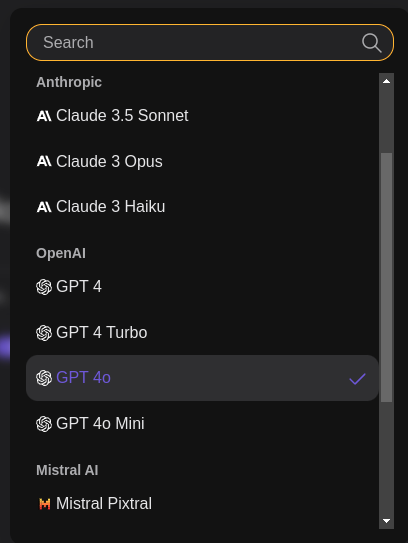
Kagi users can select and choose from multiple AI models - that's incredible! But maybe a less tech-savvy user might get confused with so many options.

I'd suggest a visual, minimalistic "rating" system based on:
This allows every user to choose the model they need at a glance.
Upon clicking the model list from Kagi Assistant, the user can see each model's ratings.
It could be 3 groups:
Group 1: "Thought Bubble Emoji" for the Creativity. 💭
Group 2: "Brain Emoji" for Logic. 🧠
Group 3: "Lightning Emoji" for Speed. ⚡️
Each group contains 3 "copies" of the same emoji.
Example of a hypothetical AI Model Rating
🧠 🧠 🧠 | 3 full "Brain Emoji" -> means it's very logical, model best used for logic solving
💭 💭 ( ) | 2 full, 1 semi transparent "Thought Bubble Emoji" -> means it's pretty creative, but not extremely
⚡️ ( ) ( ) | 1 full, 2 semi transparent "Lightning Emoji" -> means it's a slower response model
This way, knowing which model to choose becomes intuitive!