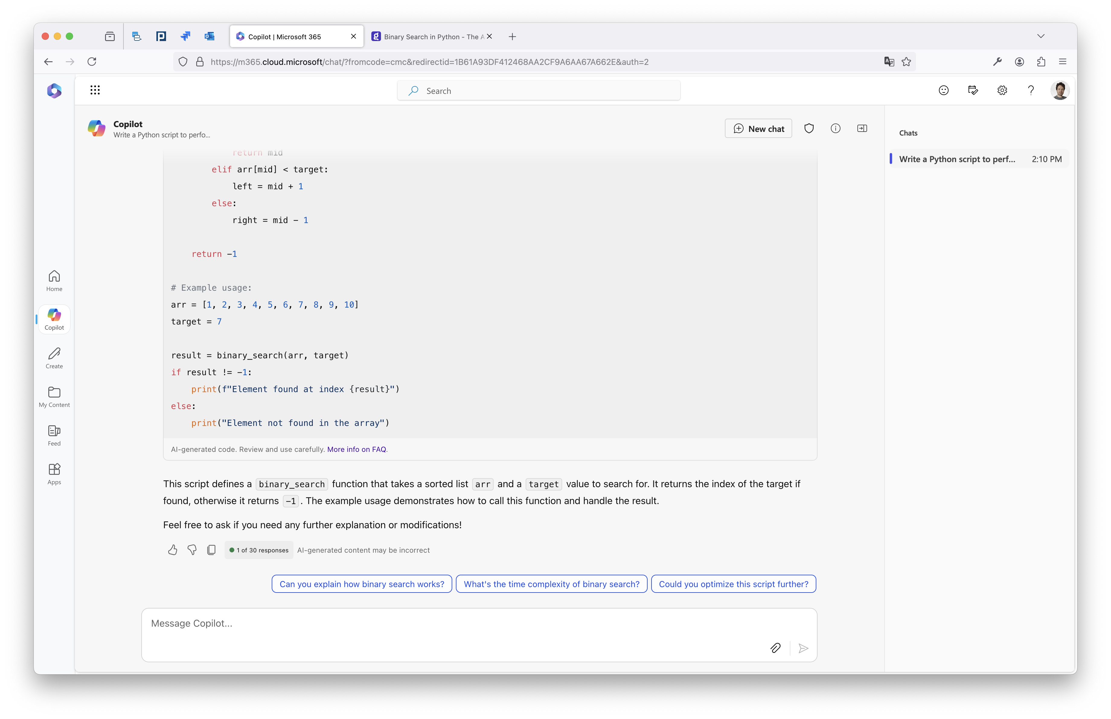
While using Microsoft 365 Copilot I noticed that I like the UI better and how it handles copying the markdown. That I have copy button also underneath my initial prompt (not shown in screenshot). And also follow-up suggested questions.

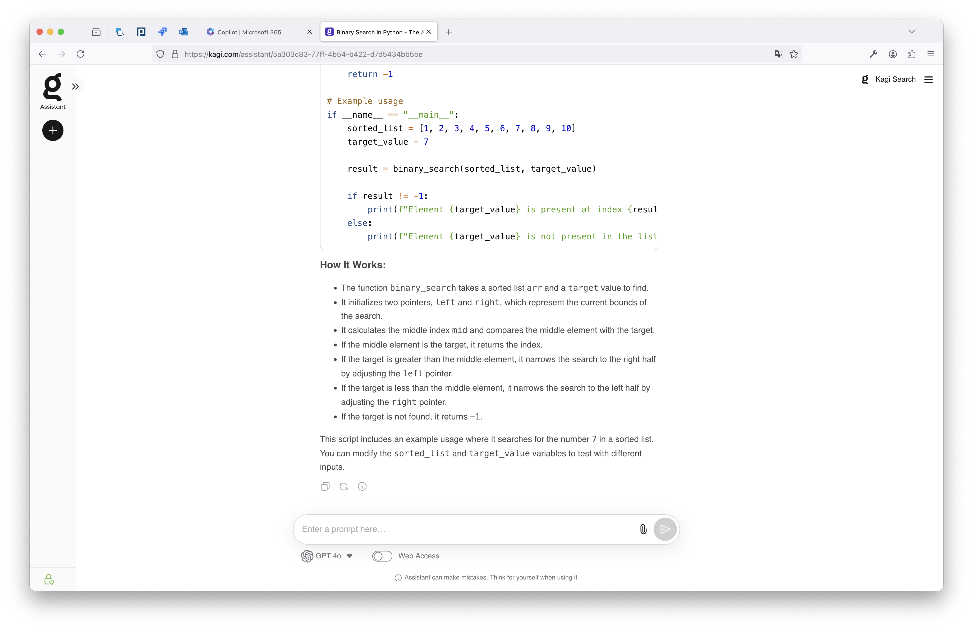
I'd like Kagi Assistant to also be a bit more similar looking in UI. Wider. Copy working better (use single ticks `, instead of triple ``` when doing inline code block). Showing remaining messages. New Chat more intuitive and easier to access.
