Improve stock info box by adding a graph and adjustable time window.
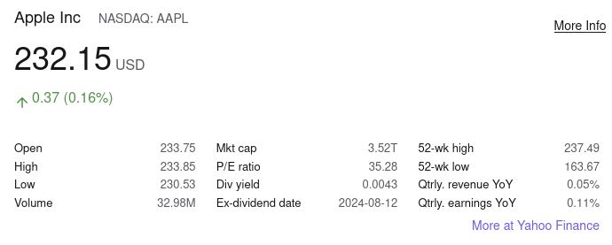
This box when searching for a stock price is useful, and I'm glad it exists:

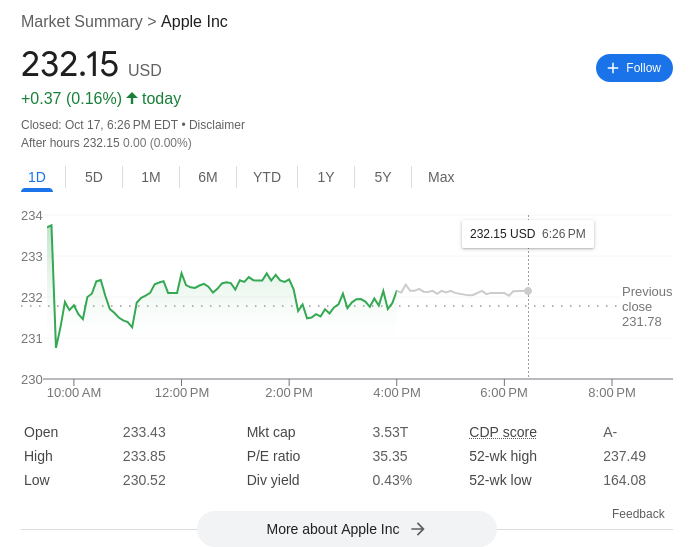
But I wish Kagi had something more like Google's stock info box:

Specifically, I would like a graph with adjustable time window. If you want to one-up Google, add a 10Y, 25Y, and maybe even an adjustable/custom time window by selecting an interval on the graph (click, drag, release).
Another feature missing from Google's box is data at the bottom adjusting by time window -- ie instead of just 52-week high / low, also showing "X high / low" where X is the time window (last year, YTD, last 10 years, whatever).
I also feel that showing APY over the selected period would be useful. For instance, on Google when selecting 'all time', it shows '+232.04 (210,945.45%)', which is rather worthless as a metric. What is much more interesting is the average APY over that period.
This is a slightly harder metric to get, but APY with dividends is in many ways a more useful metric, since typically someone is interested in how much $X of stock in 1990, say, would be worth today. Without including dividends in the calculation (which can/should be reinvested), the picture is highly incomplete.
I understand these are not simple changes to make, but I think would be great improvements to the search engine.