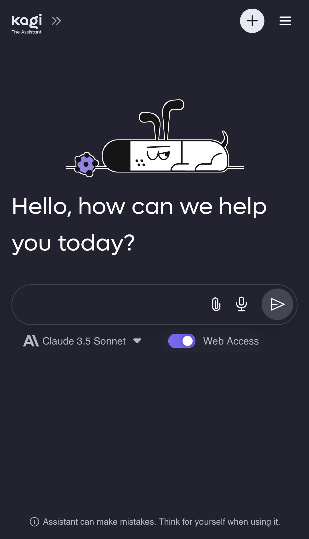
On mobile, the placement of the Kagi logo on the navbar has been moved directly next to the sidebar button. It introduces misclicks.

Previously, the Kagi logo was in the center of the navbar.
Either move the Kagi logo button back to the center of the navbar or remove it entirely to reduce the chance of misclicks occurring.