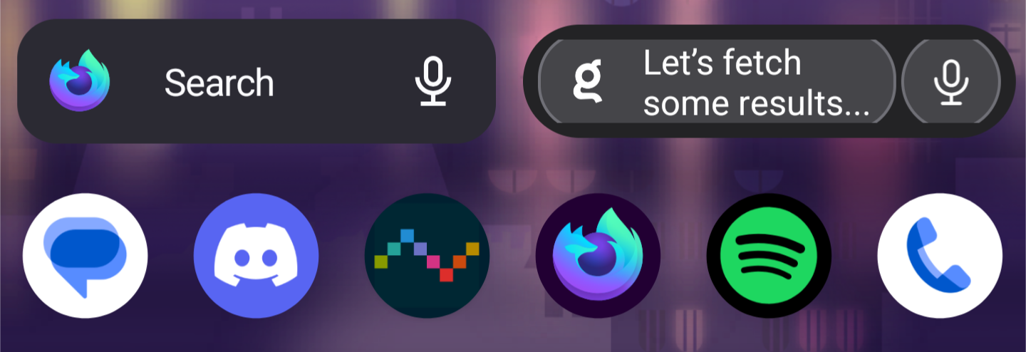
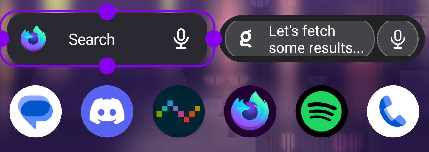
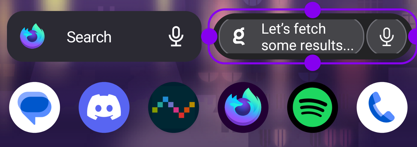
The Android quick search widget doesn't handle small sizes correctly in launchers like Nova. When made smaller than the default widget size, elements clip and look ugly. The widget also doesn't take up the entire UI row height even with padding turned off.
This can be replicated by resizing and removing padding in a launcher like Nova. You may need to increase the number of rows/columns to make it possible to make the widget small enough to replicate this issue.

I expect the widget to be resizable without clipping or cutting off design elements. The text and buttons could change depending on size similar to Firefox's search widget. I expect the widget to take up the full row height when padding is disabled.

