A few quick notes on the screenshots for the Android app on the Google Play Store listing:
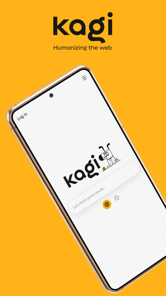
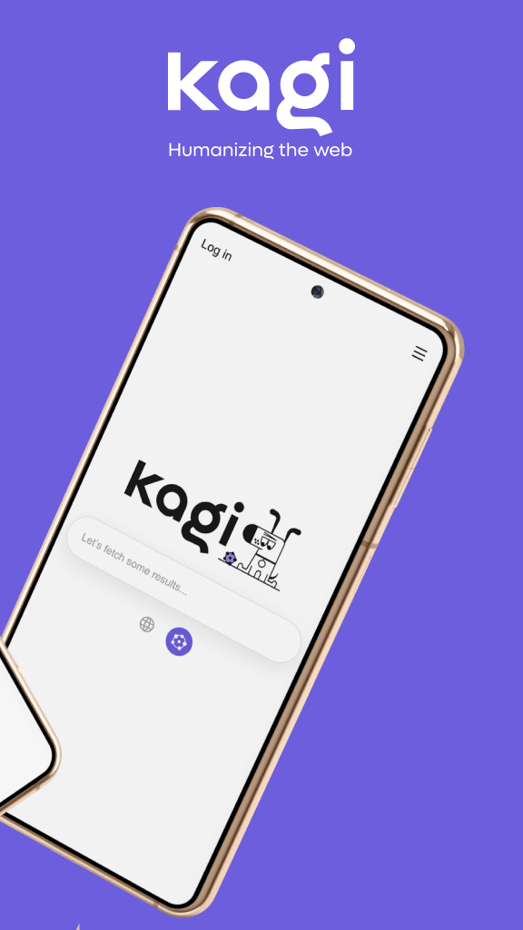
The first two images don't have a lot of info and show the same thing (a mostly empty search bar screen)...in terms of marketing, it'd likely lead to better conversion to get rid of one of them so you get to the other value proposition images quicker, especially for a user who is unfamiliar with what Kagi is.


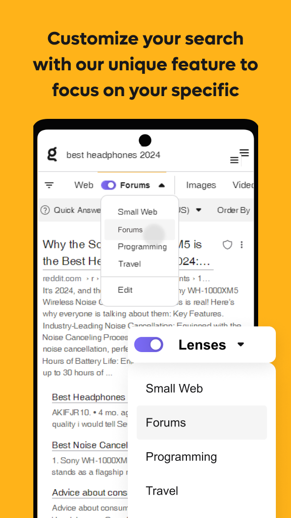
The last image seems to be missing a word: "Customize your search with our unique feature to focus on your specific"

The changes proposed above would likely improve the install rate of the Android app, and increase clarity.