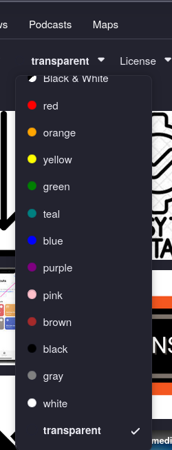
When you're doing an image search, i think it makes more sense to have the 'transparant' color option more at the top of the menu. right above where the list of colors starts.
If you open that menu, i feel like the usage of 'transparant' is much higher than any of the colors. plus some users might not even know that transparant is an option there because it's all the way the botom

see above