The new AI beta has threads which on it's own is amazing to see finally happening! Thank you for this first and foremost.
However, seeing it myself I have a few suggestions to improve UX.
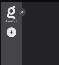
Below we see the collapsed Assistent bar, which allows us to start new threads. That's great. But it doesn't allow me to see the current and pinned threads. Which would even be more awesome!

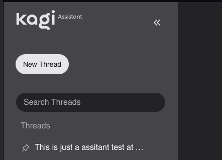
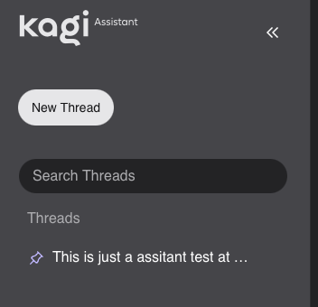
Below we see the expanded side bar where we can see our threads.

But when we pin a thread, its not really clear that it is pinned. I can only see that it is pinned by hovering over the pin and see the alt text "unpin".

So the TL;DR for improvements:
- Add the current / pinned threads to the collapsed / expanded sidebar
- Maybe even a recently open?
- Add a pinned section to the collapsed and expanded sidebar to clearly make the pinned threads visible.
Edit: Yes I'm colour blind