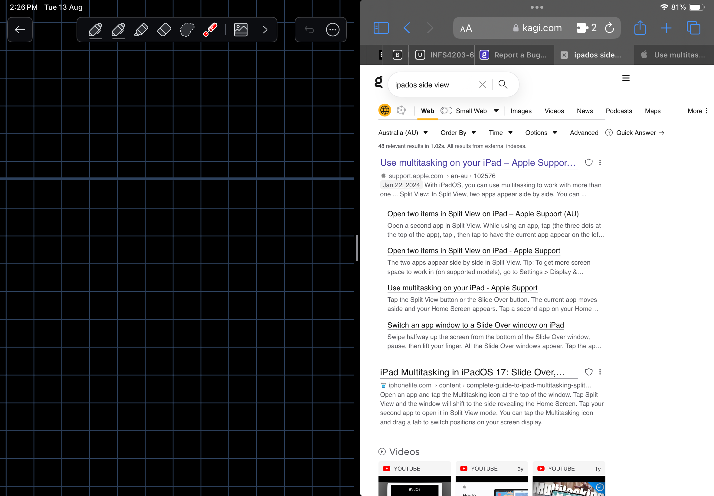
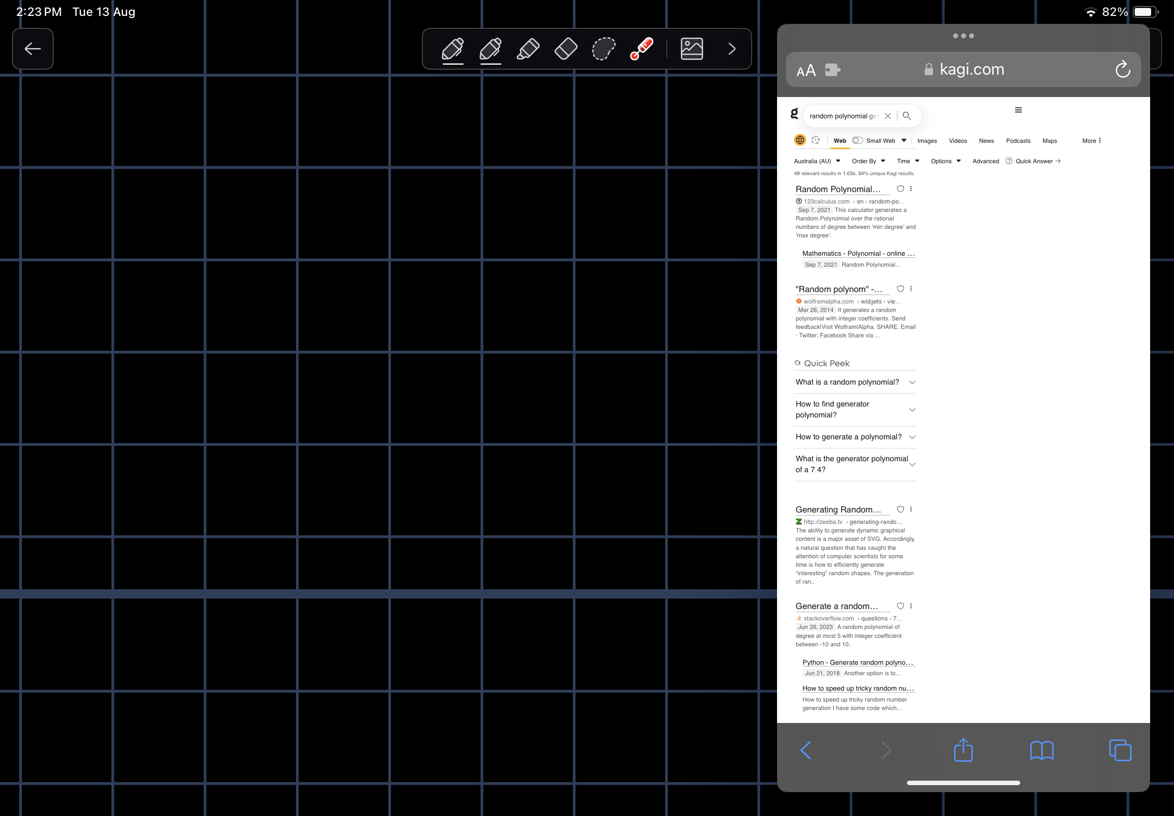
When multitasking using the Slide Over or Split View multitasking the Kagi search results page scales poorly making the page difficult to read and use. It appears that the menu bar does not scale at all and the actual results are under scaled on the Slide view. On the Split View the menu bar appears to run off the end of the page, while it doesn’t the “more” button is too close to the end of the screen.


For the small Slide Over multitasking I would expect similar scaling to the iOS page version.
For Split View I would expect something in between, using most of the available screen realestate.