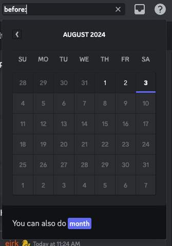
Make the filters have little pills indicate that the filter was properly parsed.
IMO existing UX is fine, but it sometimes may be unclear if a filter was used or not, especially if there were typos or spaces that prevent the filter from being used.
The dropdowns for dates could be nice, but aren't necessary.
IMO it is best for only a little pill to indicate the parsing of a pill, rather than an actualdropdown
Examples (from discord and apple mail)


