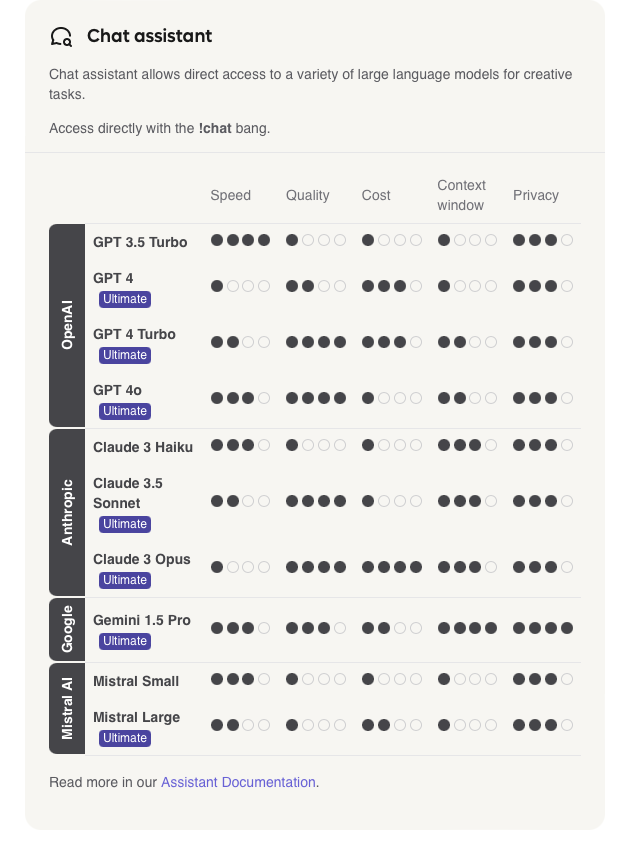
What are the thoughts on making the label for what "Privacy" means on the Kagi Assistant page more clear? Are more dots better for my privacy or worse for my privacy? My thoughts is that more dots is worse since Google has a higher score, but that's my personal bias about Google's privacy (and some facts :p) showing.
My initial thoughts would be just "Private" but then pretty much no provider would get a good score, or at worst case be even more misleading.
Just something I was thinking of.
V/r

See above ^^^